Date:
April 25 2018
**What happened to whimsy & delight?** I walked into an Apple store several weeks ago because I was bored and I’ve been coveting a MacBook Pro for awhile (as my boss damn well knows). I’m not breaking new ground here by saying they make great products. They do. They also don’t get enough credit for [pushing for progress](https://www.digitalmusicnews.com/2017/02/09/apple-35mm-headphone-jack/) within the tech industry. But I digress. When was the last time you walked into an Apple boutique? Do you remember what it *felt* like while you were perusing the pristine objects of desire, perched atop ellagant Dutch Essenza tables, in a building made of glass? A space that’s a little too clean? A refrigerator filled with nothing but soylent clean. And what of the instruments laid neatly along those nice tables? Err, I mean products. As Lisa Simpson recently remarked, didn’t it feel sterile? Let’s go back a bit. Remember when Apple used make these? > 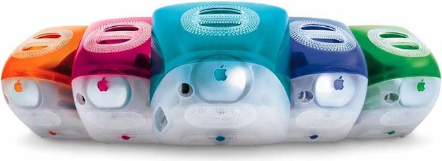 And these >  Did you even know Google still did this? > 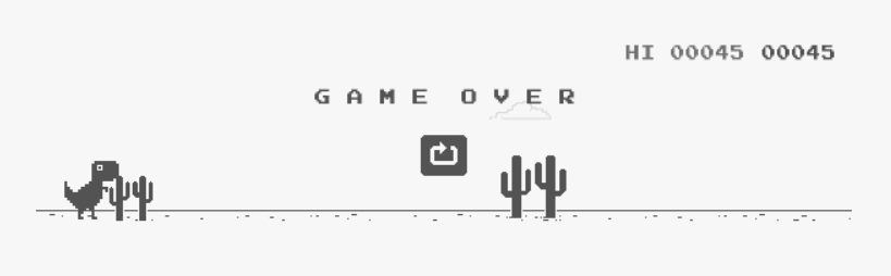 That gem only pops up when your wifi breaks. **The state of things** When I look around at today's products, I see a bunch of repetition. If a product doesn’t look like a sterilized probe then it looks like an overly designed alien robot spawn. I’d like to know what happened to our profession? >  On the left is a Quip toothbrush. It looks like it can be found on the accessory wall at the Apple store under Dongles [snickers]. On the right is an ASUS wifi router, aesthetically, it’s the result of an [Alien](https://s.hdnux.com/photos/40/12/02/8429731/5/920x920.jpg) [implanting](https://en.wikipedia.org/wiki/Alien_(creature_in_Alien_franchise)#Chestburster) a cable box. When was the last time you saw a cell phone or TV that didn’t look like a shiny and thin rectangle? Better yet, look around your home and notice how many pieces of tech can be found on the set of a Fahrenheit 451 adaptation. It’s not just electronics, automotive design is no different. Take the [minimalist Tesla 3](https://article.images.consumerreports.org/prod/content/dam/CRO%20Images%202018/Cars/February/CR-Cars-Inline-2018-Tesla-Model-3-ATC-int-2-18) or the [transformer Civic](http://gearopen.com/wp-content/uploads/2017/04/2018-Honda-Civic-Type-R-Si-hatchback-4-695x406.jpg) for example. The first, I call clinical minimalism and the latter is technicool. The designs are either too clean or overly designed to appear technical. Both styles have their place and look good but are nearing comical parody. **Why so serious?** Trends come and go which is the nature of style, and the last decade has been defined by minimalism. A trend, I believe, was spurred by the design process revolution, popularized by the likes of Dan Brown at IDEO and his contemporaries. I’ve been a design process junky for a while because it’s important in dealing with ambiguous problems that designers are trying to solve. But it has caused us to lose *something.* Design thinking first entered our collective lexicons, thirty years ago, and it was brilliant because it introduced a new way to approach design as a problem solving exercise. The shiny new tool offered a multitude of possibilities for attempting to solve difficult challenges. It asks designers to reduce their endeavours to only problems and solutions. Solutions that are then refined through testing. But today the concept has evolved as more companies have adopted design methodologies. The increasing growth of Silicon Valley, the advent of powerful computing introducing big data and analytics, and general [asinine tech culture](https://www.theregister.co.uk/2016/08/01/peter_thiel_wants_young_blood_for_longevity/), has shifted the design process to rely more on metrics and analysis. Designers have been forced to view their profession through the lens of science [in that their solutions can merely solved through formulas and data], rather than human centered, empirical and instinctual. As we’ve been asked to justify every decision through reasoned logic, analytical proof and evidence, designers feel less compelled to rely on instinct. Instead we apply established paradigms or use inane ‘data’ to make choices. At best, it provides bland cookie cutter results. At worst it leads to bogus interpretation of bogus data, likely collected through dubious methodology. It leads to poor choices and bad design. In other words, something Gwyneth Paltrow would sell on her [website](https://goop.com). **Soulless dystopia** When applied to aesthetics, these processes have lead to the minimalist revolution. Reducing components to their bare essentials results in a cold and literal presentation. These trends remind me of [this scene](https://www.youtube.com/watch?v=2oEnJfZ9joY) in The Matrix. Particularly the last line: > **Dozer:** It's a single-celled protein combined with synthetic aminos, vitamins, and minerals. Everything the body needs. > > **Mouse:** It doesn’t have *everything the body needs*. Take Google's approach to design, the now[ infamous example](http://www.nytimes.com/2009/03/01/business/01marissa.html?pagewanted=print) (more on that [here](http://stopdesign.com/archive/2009/03/20/goodbye-google.html)) of testing 41 shades of blue links to find which results in the more clicks. The approach is called *data driven design.* Boy that sounds neat! Laboratory clean room neat. Clinical. Sterile. Sanitized. Pure. Antibacterial neat. [Material design](https://www.youtube.com/watch?v=rrT6v5sOwJg) is modeled off real paper. It’s a fun concept that conjures up memories of glue sticks and construction paper. Google designers spent months making sure they correctly mimicked how light affected folded construction paper to achieve maximal realism. Even this creative endeavor had to be couched in intense examination of literal behavior and applied as such. Which is odd because paper and digital are on opposite ends of the spectrum as a canvas. Nonetheless, designers felt compelled to make their fun idea as pragmatic as possible. Material Design, Apple’s lame knock off of material design or Windows 8 Metro are clean, but are they enjoyable? Sure they are well designed in the sense that they are based reality and well established constructs (Windows 8 is based on metropolitan subway signage). To use an analogy for Mouse's point, no cook thinks of their creation as an assemblage of aminos, vitamins and minerals with a caloric value efficiently packaged to fuel the body. They think in taste, presentation and delight. The same way designers don’t think in terms running experiments, [atoms & molecules](http://atomicdesign.bradfrost.com/), data or pragmatism. Similarly, technicool evokes technical design and functionality. Ironically it’s [superfluous crap](https://jalopnik.com/cars-with-awful-fake-air-intakes-1631734771) but that isn’t the point. The point is that every angle and doohickey appears functional. Apparently, there must be a reason an economy car needs four fake side scoops and a diffuser. It’s worse because it’s dishonest. I’d be less inclined to hate it if it didn’t take itself as seriously. Dozer thinks that his meal is the *only *nourishment the body needs while, Mouse understands the soul requires as much nourishment as the body. Much like modern product design, we're only solving for the problem and not for the soul. We are creating these products and design systems that offer continuity and consistency but lack fun and adventure. Functional considerations are critical, ease of deployment is worthy and refinement is necessary but it’s not everything.* **Make design fun again** For my friends in web this purity is justified in the name of performance. I’ve seen designs scaled back to shave off hundreds of a second in load times. Web design is also no stranger to the clean aesthetic, just hop on [squarespace](https://www.squarespace.com/templates/) to bathe yourself in digital antiseptic. At my current place of employment, usability is a commandment and a heuristics violation is a mortal sin. To be fair, I’m currently working on a Tier 3 FDA medical device. It means it can kill you. It will be far from whimsical I assure you. We design serious software for technical industries but that doesn’t mean it can’t be fun, right? You mean to tell me that engineers working on multi million dollar gas turbine engines, using software that pours over thousands of pieces of data, don’t want a little fun in their lives? Now I’m not saying we design the woman in the red dress, that Mouse the digital pimp, was ready to hook Neo up with. I’m also not saying we sacrifice usability for gratuitous animation or wacky behavior. What I’m saying is a defibrillator has no room for fun or whimsy but a toothbrush need not look like an anal probe. **Trust your instincts** We are professionals that occupy a fluid domain, and the nature of our business requires us to be flexible. If you’re like me, you’ve been honing your craft and skill set since the day you first picked up a crayon. Trust your instincts, they’re pretty damn sharp. If the feeling is that something should be fun and red then make it fun and red! Make the argument for whimsy. Don’t belie it in design doublespeak or water it down in pragmatism. It’s okay to behave like a scientist but it’s also okay to play like a designer. Let’s unshackle ourselves from these joyless trends. Admittedly Google is at least [heading in the right direction](https://blog.prototypr.io/google-and-the-resurgence-of-italian-design-e9234cf3d073). What made Apple, Apple, were their carefree and fun products. They used to take risks and made the mundane fun. Today their products look hygenic and everyone is prepared to follow suit. Today it feels like we are creating ‘everything the user needs’. To which I say, we aren’t creating everything the user needs.