Date:
November 2017
Client:
World leader in spray application and precision farming technology.
Role:
UX Designer and visual design direction
My Role
- Senior designer working along side a junior designer.
- Set visual design direction and assisted in visual design pattern library
The Project
- Redesign a clients current product that allowed farmers to track the progress of their spraying, tilling, and harvesting jobs
The Challenge
- Create a user friendly GPS tracking software that allows farmers to perform and track an array of various functions
- Intuitive process for starting jobs and selecting the right equipment
- Faster access to job tools
- Displaying job progress
- Display implementation details along with job progress on a limited screen size
- Create a create modern design
- Icons and representations that make sense to users
The Strategy
- Design Thinking
- User Interviews
- Card Sorting
- A/B Testing
- Material Design language
The Solution
- Jobs based design that required users to start or continue work by creating or selecting a job
- Quick access to often used job tools
- Simplified icons and modern visual design language
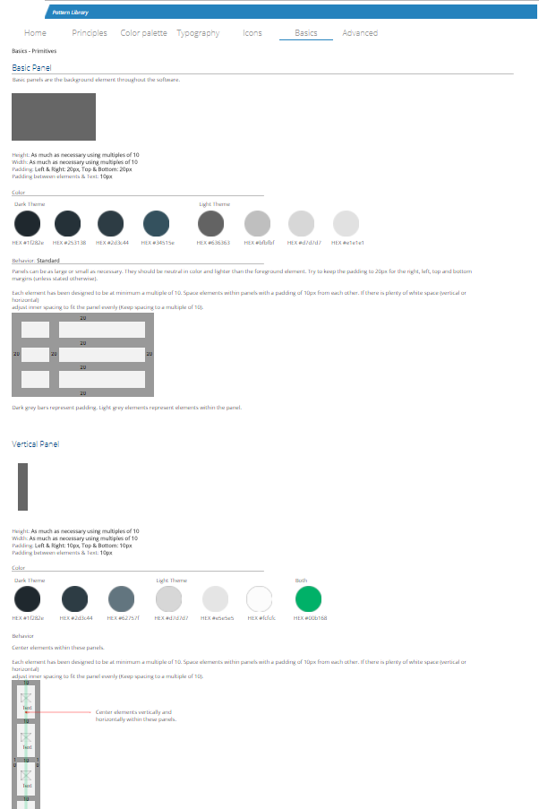
- A pattern library with repeatable elements

Research
An analysis of the user base for the existing client product line was conducted during our visit. We identified 4 primary user types:
- Support Staff
- The OEM / Dealer
- The Owner / Operator
- The Employee Operator
Field Testing
The team went onsite for a client visit that involved riding in a tractor (yay!) and discussing all aspects of the problem of tracking jobs on farm fields. We were introduced to the current software and got to experience first hand from users what they liked and disliked. We had extensive conversations about what they would like to see in the future, along with observing how they perform their jobs.


Usability A/B Testing
Our engineering team created a terminal for us to run the Linux based software and the client provided a fully functional demo. Using the demo, we created an A/B for 6 different participants and recorded the completion and time on task.
- A/B Tasks
- Configure Implement
- Setting up a job
- Set up guidance
- Applied mapping
- Displaying status
- Configure console
- Close job
- Map boundary
- Remote diagnostics
- Finding help
- Summary view
- User-defined hot keys
Interviews
During the A/B testing we also asked participants a number of questions that allowed to gain insight into the current product. These interview style questions were primarily qualitative while the A/B test was able to give us quantitative results.
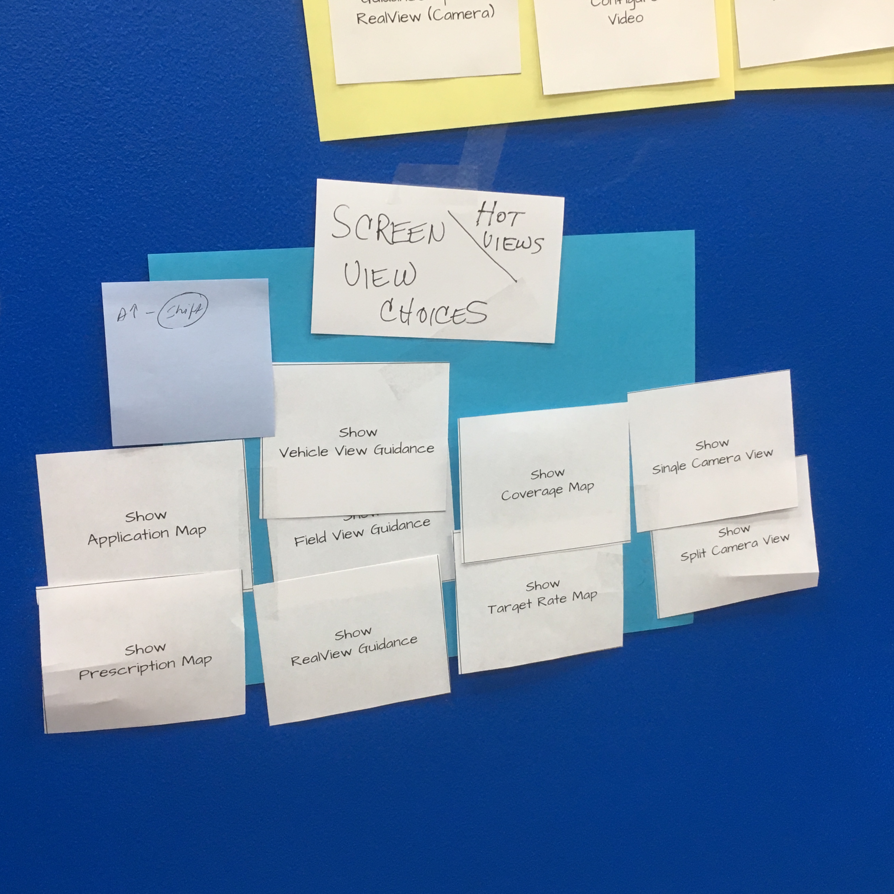
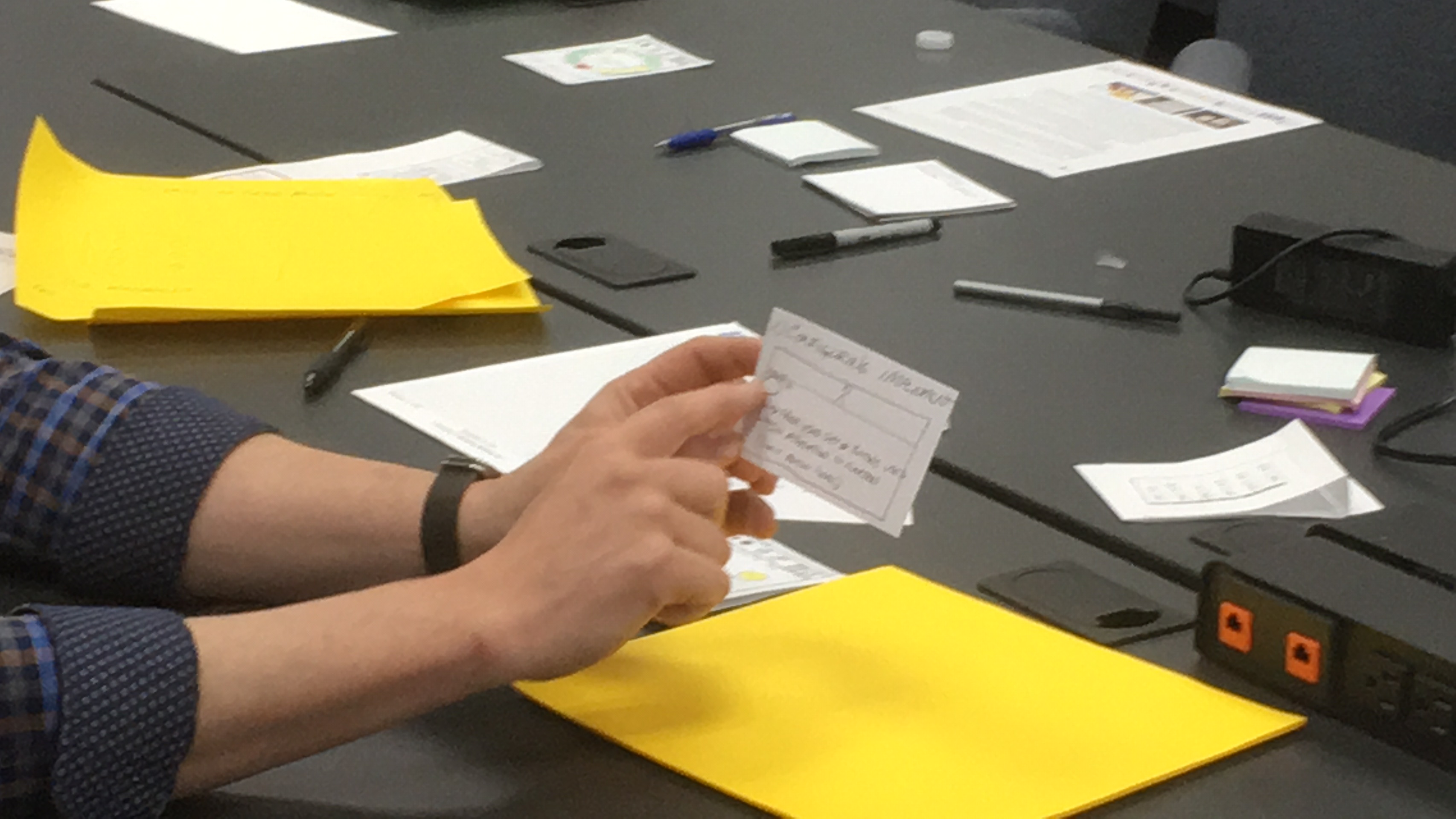
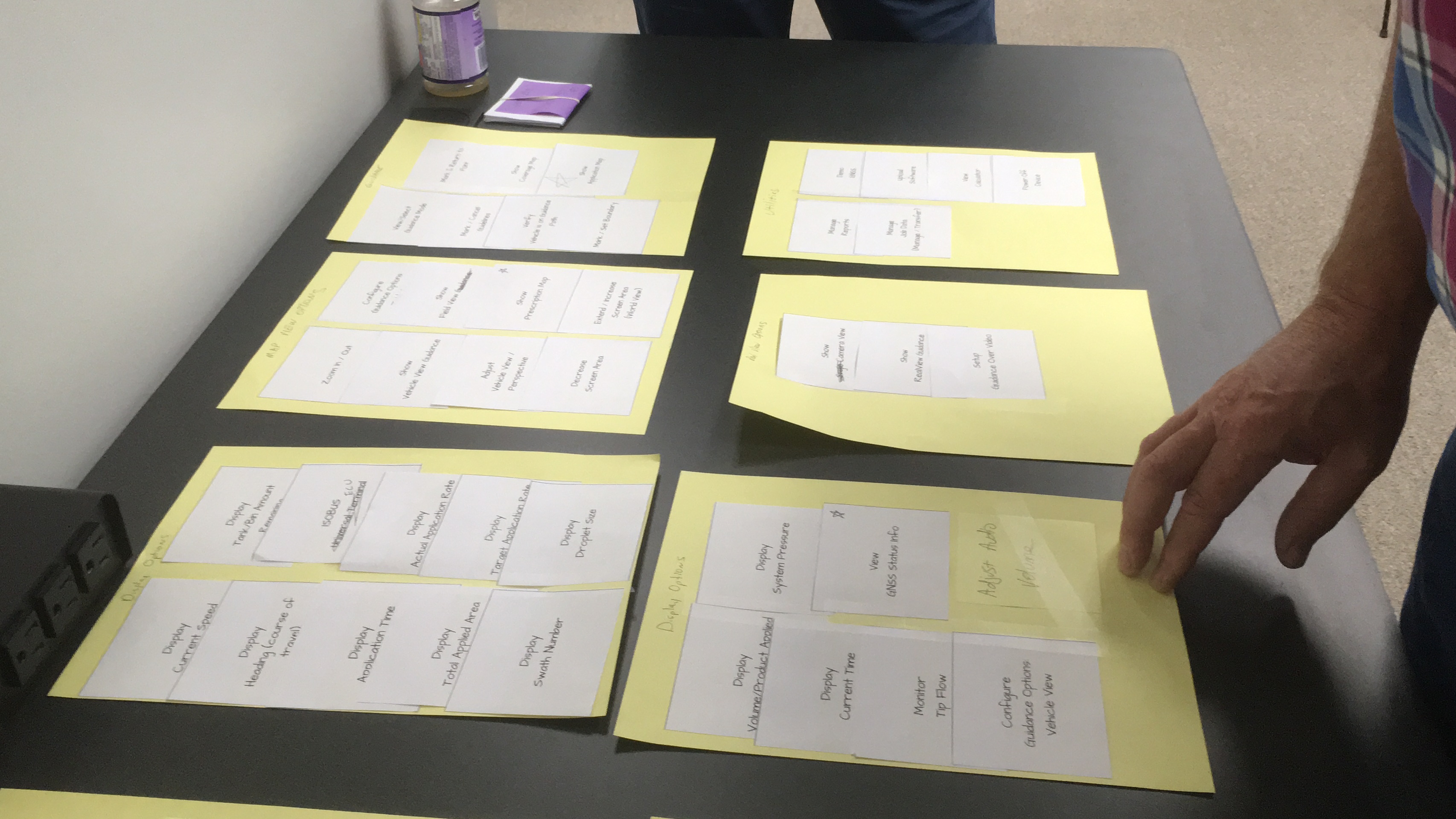
Card Sorting
We used card sorting techniques to develop the initial information architecture. We created a hit list of problems we need to solve for, and we had the client and their users draw out the parts of the process and then sort them.

Research Analysis
- General Issues
- Lack of consistency in alarm / warning handling
- Long boot time, lack of status during boot
- Certain OEM screens accessed by visually unapparent, “secret buttons”
- Lack of visual indication when system is running on “demo mode”
- Pop-up windows are hard to discern from background GUI
- Inconsistent icon styles and form across the system add complexity to understanding the functions they control
- Poor contrast on gray themes with black text is difficult to read
- Home / Job screen
- The information about client, field, etc can not be edited on the device and there is no user feedback for the operator to find out how to input this data
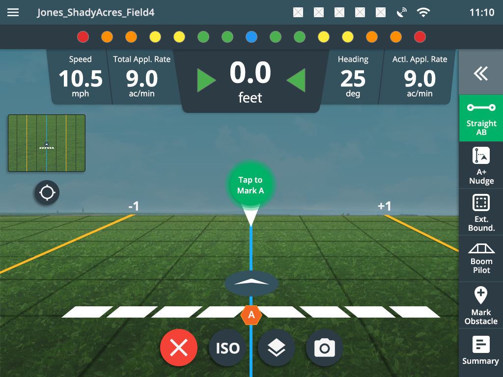
- Vehicle View Guidance screen
- Tray Icon touch targets appear too small and close together
- Status bar icons are a tap once to show, but can’t go to another status screen without dismissing first screen
- Not obvious what status screen was accessed from status bar
- Not obvious how to dismiss status screen
- Selectable Information and Activity Box measurement formats on Guidance Bar is not an apparent, user selectable action
- Use of color on the status bar icons is inconsistent
- BoomPilot uses the same green icon in the Tray as a control as on the status for actual status. The use of the same icon variant only by red/green color is also problematic because of color blindness issues
- Selection of colors for droplet size seems very arbitrary; use of the symbol (XF, VF, etc) or even a number would seem to convey more useful information
- Not a lot of navigation help in the Tray menu; you only know there is at least one level above you
- Number of icons in the Tray is highly dynamic, and does not give clear indication which ones trigger a menu change or a direct action
- Field View Guidance screen
- Is there really a distinction between Vehicle View and Field View screens in terms of what data is displayed? The main difference seems to be the zoom level.
- System Setup screens
- Tool tips/quick info label tap is not visually apparent
- Extras screen (Calculator, Units Converter) apps are of questionable value
- The Calculator and the Units Converter are both basically dialog boxes, but they are visually different on several levels. Calculator seems to be implemented as an inconsistent dialog box, but Units Converter follows the Next Page pattern seen elsewhere
- The layout of the Units Converter is not optimal. The “to” value is tightly tucked between a keyboard and a dropdown list.
- The label “Upload Software” seems confusing. You are downloading from USB to the device. In fact, “Update System” might be more accurate.
- A few parameters, such as Section Lengths and Section Offsets, have a single Keyboard icon on their screen, which actually performs a Next Page action.
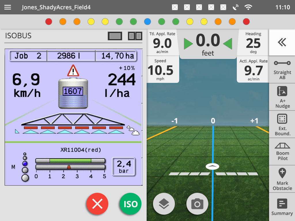
- ISOBUS Universal Terminal (UT)
- The visual appearance of the UT is not modern, but it is understood that this is a result of 3rd-party devices displaying images in a framework. However, it may be possible to modernize the graphics of the framework to achieve a better user experience.
The Design Process
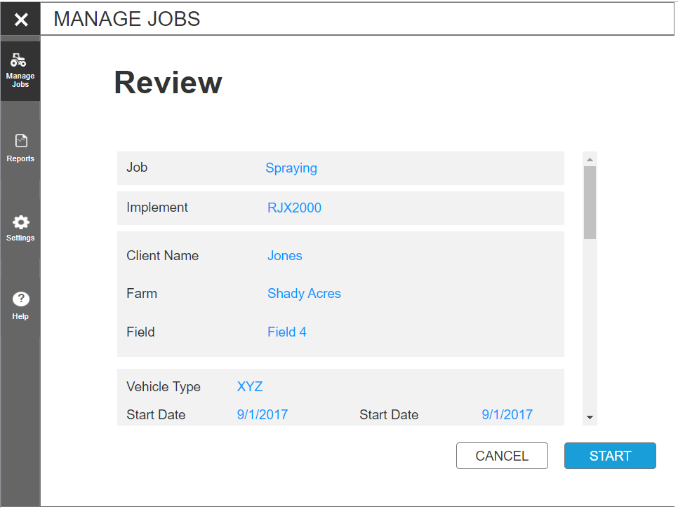
There were several critical problems we had to address, such as starting a job. It had to be fast, intuitive and allow for as few mistakes as possible. Once we synthesized our research, we created a few bullet points and brainstormed several starting sequences. The team created storyboards of the current process and how it might work in the future. By making storyboards, we were able to get the client to think about the process (as steps) their users go through. We presented 5 difference starting sequences as possible designs for the future.

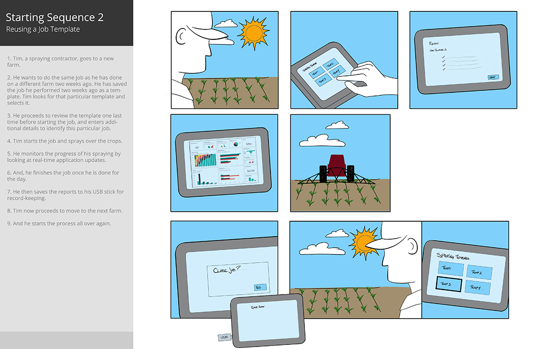
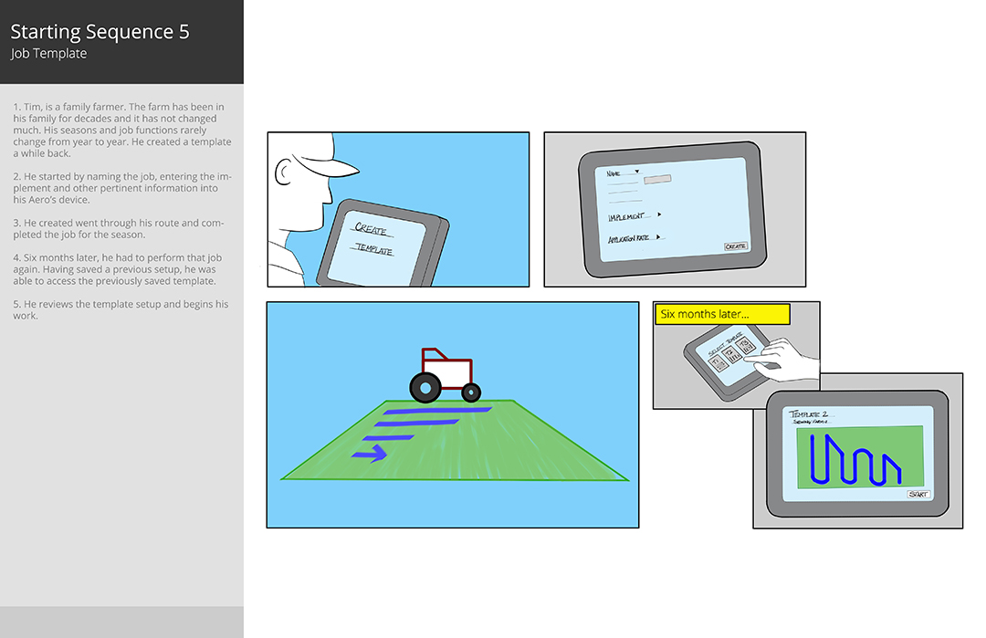
The sequence that the SMEs and stakeholders ultimately decided on was one where users can quickly start a job, select job type, select the correct implementation device, and adjust their settings before in a step by step sequence. It was a blend of three different approaches. In order to reduce cognitive load when finding a job we offered that they be sorted by GPS location (Since the tool was a GPS device this was easy to implement) and have a graphical representation of the area of the last job that was performed.
Once we nailed down the starting sequence, we got to whiteboarding (Sorry E.B. Webb but I had to verb a noun).

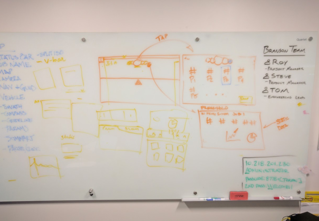
In typical whiteboard fashion, we jotted down the hit list and went to town. By went to town, I mean we created a rats nest of sketches that involved yelling, laughing and scribbling.
Wireframing and Prototyping
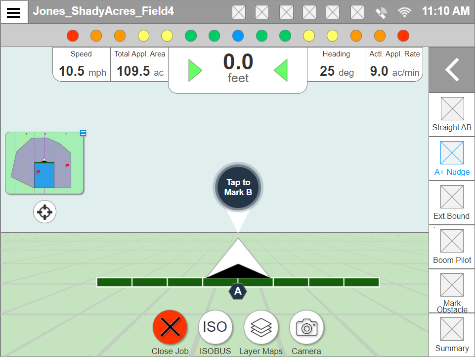
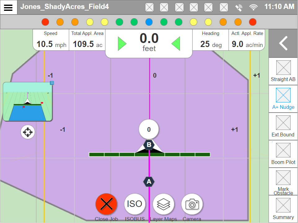
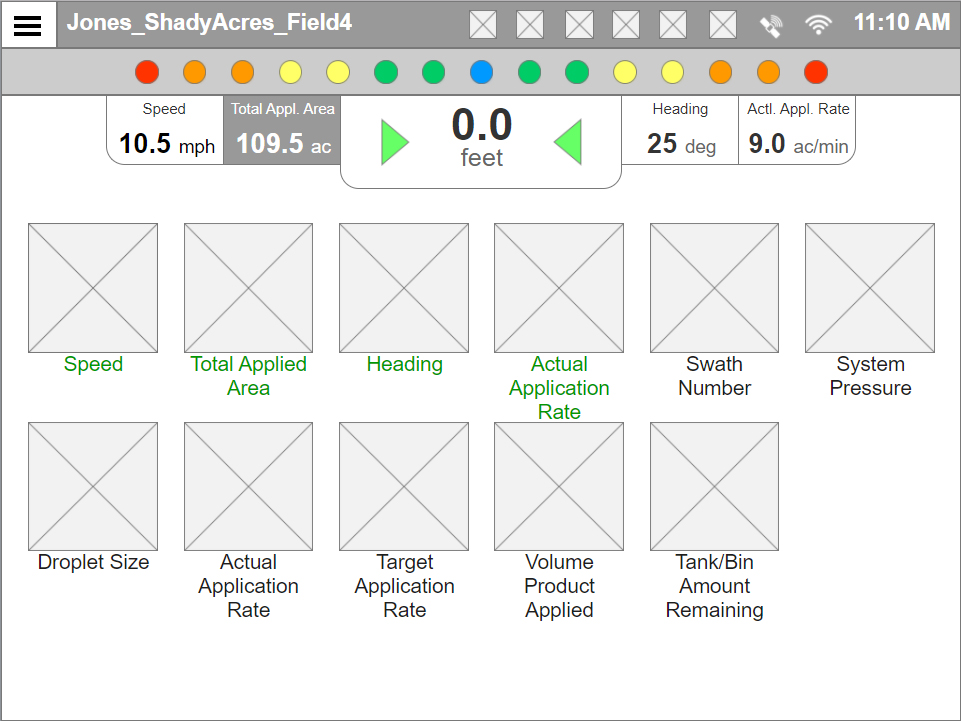
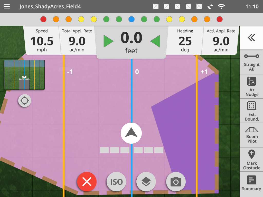
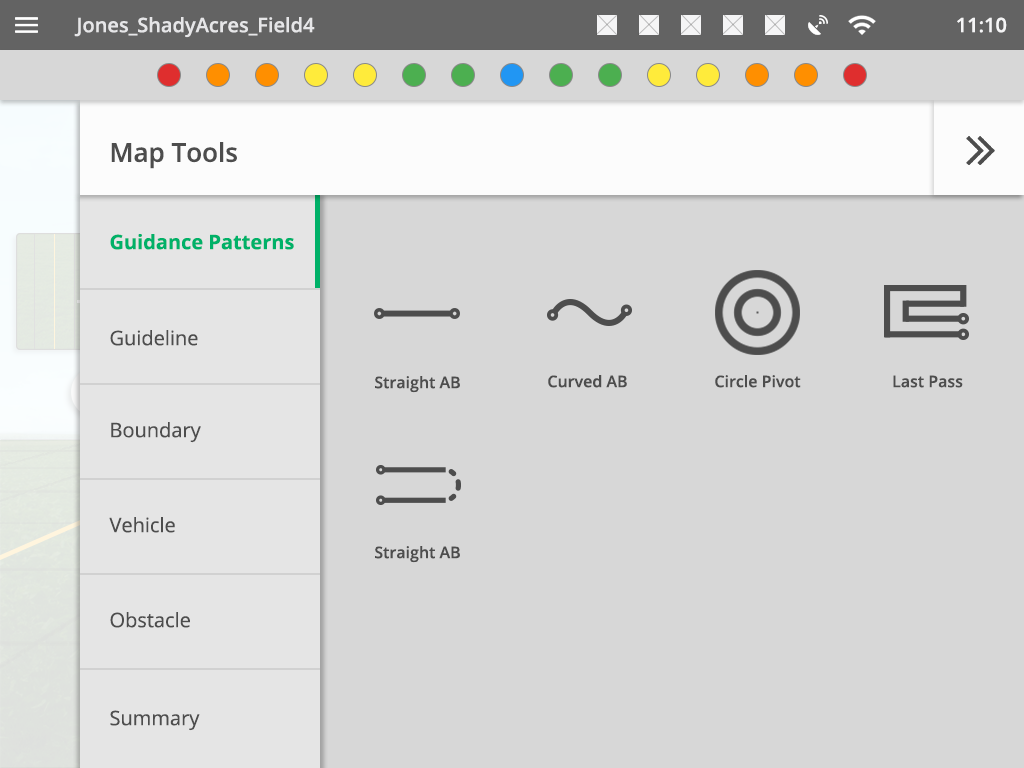
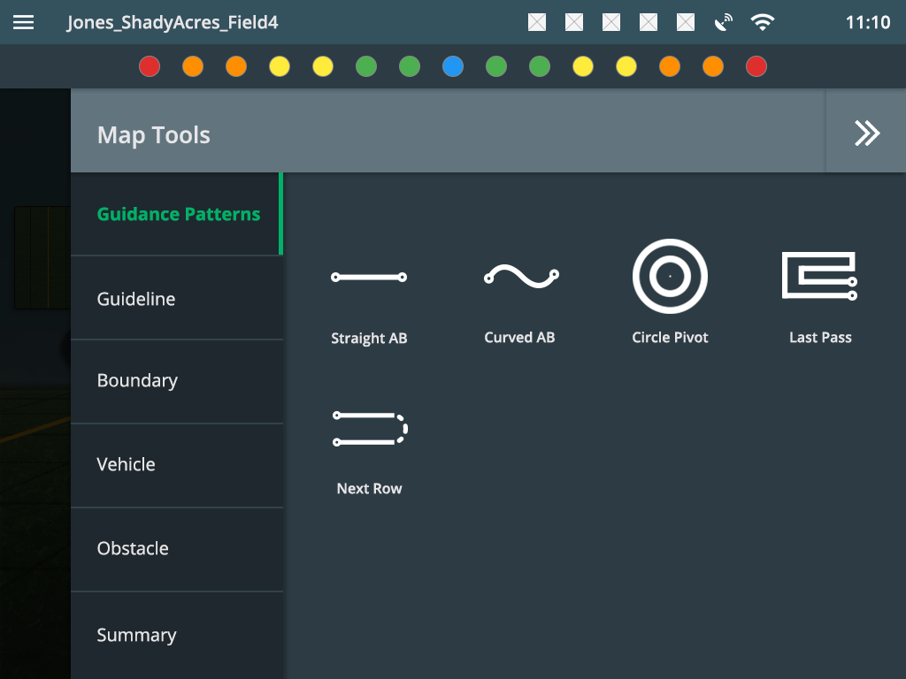
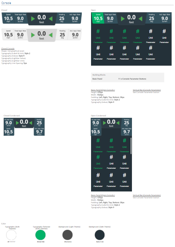
The vast majority of the prototypes we create are in Axure. We had to display a lot of information and functionality within a small window such as a lightbar and multiple map views. Other than a faster starting sequence, we also incorporated a better summary of the job progress, and used a tool tray on the right for fast access to a users most often used features. The summary had 4 programmable options that were always on display, and by tapping the top console users could expand and view the rest of their job summary.

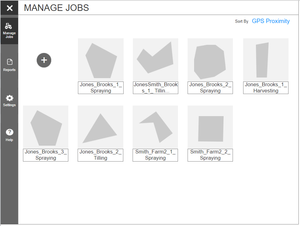
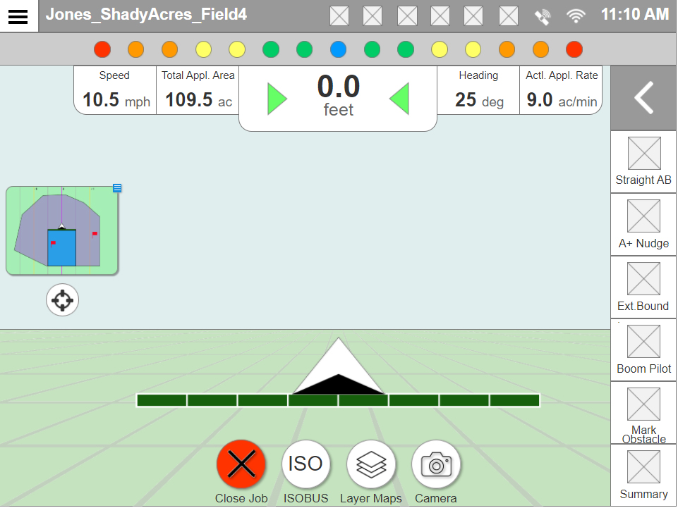
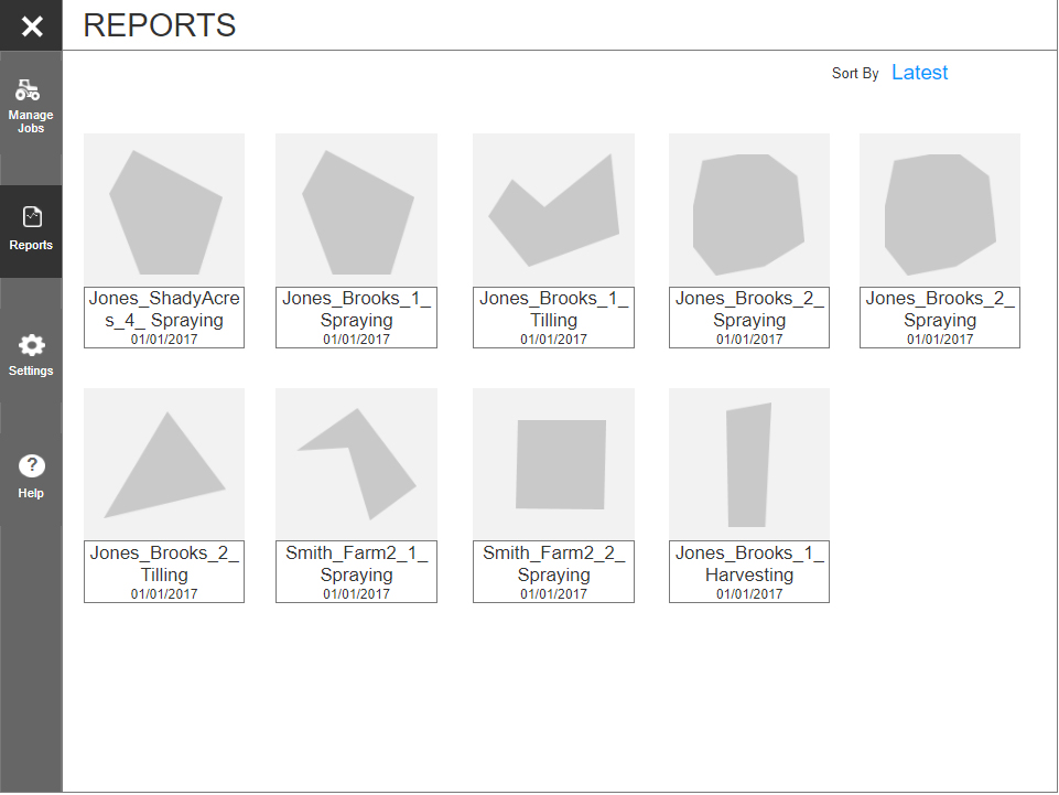
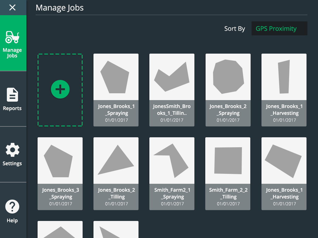
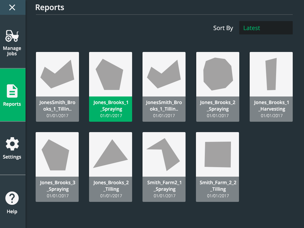
We were also asked to redesign a better system for managing reports and editing a vehicle or implementation. The object here was to use similar patterns. Jobs had to be recognized quickly. To do that, we designed cards with thumbnail representations of the coverage map for the job. Both jobs and reports were represented in this way. We used the idea of cards for vehicles and implementations as well.


Testing
Testing involved 8 different users from the US and Europe that spanned three different rounds. We used GotoMeeting and an Axure prototype. The first round involved a script that addressed the key issues we were solving for. We tended to find what worked and what didn’t, such as our implementation set up was far too basic. Participants liked the starting sequence of creating a job but asked if it could be shortened. They were very happy with the summary on the job screen but asked if we could reduce the amount of information being shown. The quick access tray was also well received.
The second round of testing involved getting feedback on the items addressed in round 1. This allowed us to further refine the design and move forward to visual design.
Visual design testing included outdoor testing in bright sunlight conditions. We found that early concepts did not provide enough contrast during day mode, but night mode was excellent.
Visual Design
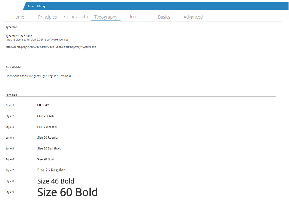
The client asked for a clean modern design, that was easy to develop and maximized performance. They also asked for cleaner and easier to understand icons. We decided to use a Material Design approach, Open Sans font, and material design icons along with text. There were two themes: day and night.

We provided the client with a pattern library because they had future features they wanted to incorporate but didn’t have the budget to finish them. When designing, we were careful to make sure that we were using similar patterns where appropriate. As mentioned earlier, for example, reports, jobs, implementations and vehicle were all made using the same card element.


Wrap Up
- During visual design testing, our users were enthralled with the new design. Feedback was overwhelmingly positive
- We addressed the primary concerns of the software through design thinking methodology
- The pattern library was designed to allow the client to use repeatable elements and patterns efficiently without needing many screen comps