
Summary
An FX payments platform that leverages three separate systems (pricing, settlement, and reconciliation) to execute multi-currency payments.
I led the UX design of a unified FX payment application that consolidated funding sources, beneficiaries, pricing, settlement, approvals, and audit visibility into a single experience, balancing novice usability with trader-level sophistication.
The initial Phase 1 design was built for a single client, but the system needed to be malleable for future client adoption. This meant designing for a wide range of personas, from experienced FX traders to treasury and accounts payable staff making occasional payments.
The project evolved over two years in an agile, shifting environment with expanding scope, regulatory considerations, and technical constraints.
The Problem
Executing an FX payment required navigating multiple systems:
- One system to initiate funding
- Another to retrieve live FX pricing
- A third to settle and reconcile the trade
- Later, a fourth system to analyze performance
For novice users (treasury, accounts payable), this fragmentation created confusion and operational risk. For experienced FX traders, flexibility and precision were non-negotiable.
The organization needed:
- A single interface
- Access to all funding accounts and beneficiaries
- Real-time FX pricing
- Approval workflows
- Settlement coordination
- Regulatory audit visibility
But underneath, the systems remained separate.
Phase 0: Selling the Vision
Before a traditional product development process began, I was asked to design a high-fidelity prototype that simulated integration across systems.
The goal was to create stakeholder buy-in and show the client a proof of concept.
I designed a cohesive, modern interface that:
- Unified funding sources and beneficiaries
- Displayed FX pricing inline
- Modeled trade execution and settlement flows
- Reduced cross-system mental switching
The prototype successfully aligned leadership and unlocked development investment.
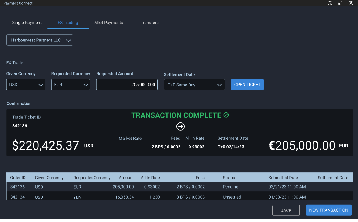
A visually pleasing payments solution to help sell the vision
Designing the Unified Flow
Once stakeholder buy-in was achieved and a contract was signed by the client, the product manager and I began building out a product requirements doc to handle the following needs:
- Select the funding account (including currency and balance)
- Select a beneficiary (account, SWIFT, currency)
- Choose settlement date
- Retrieve live FX pricing
- Confirm and submit for approval
Under the hood:
- Pricing was retrieved from a separate FX system
- Settlement occurred in another system
- Reconciliation synced back to the funding source
- Analysis tools were layered in later
The challenge was to make this feel like one coherent action.
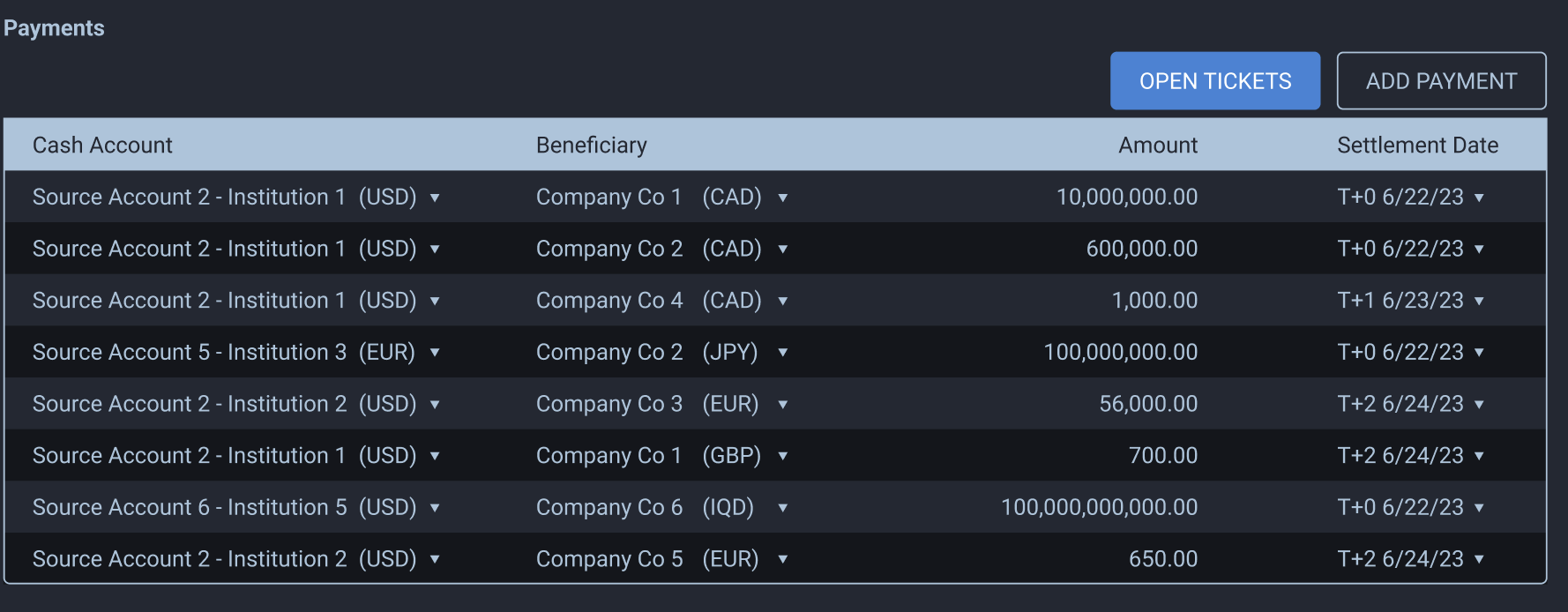
This was an early prototype that allowed users to add payments and then open payment tickets. This quickly morphed into a more capable application that did much more.
Designing for Dual User Types
This system had to serve:
Novice Users
- Accounts payable
- Treasury staff
- Occasional FX users
They needed:
- Clarity
- Guardrails
- Reduced error risk
- Simplified mental models
Experienced Traders
- Expected control
- Expected precision
- Needed access to rate timing and settlement nuance
The interface had to abstract complexity without removing power.
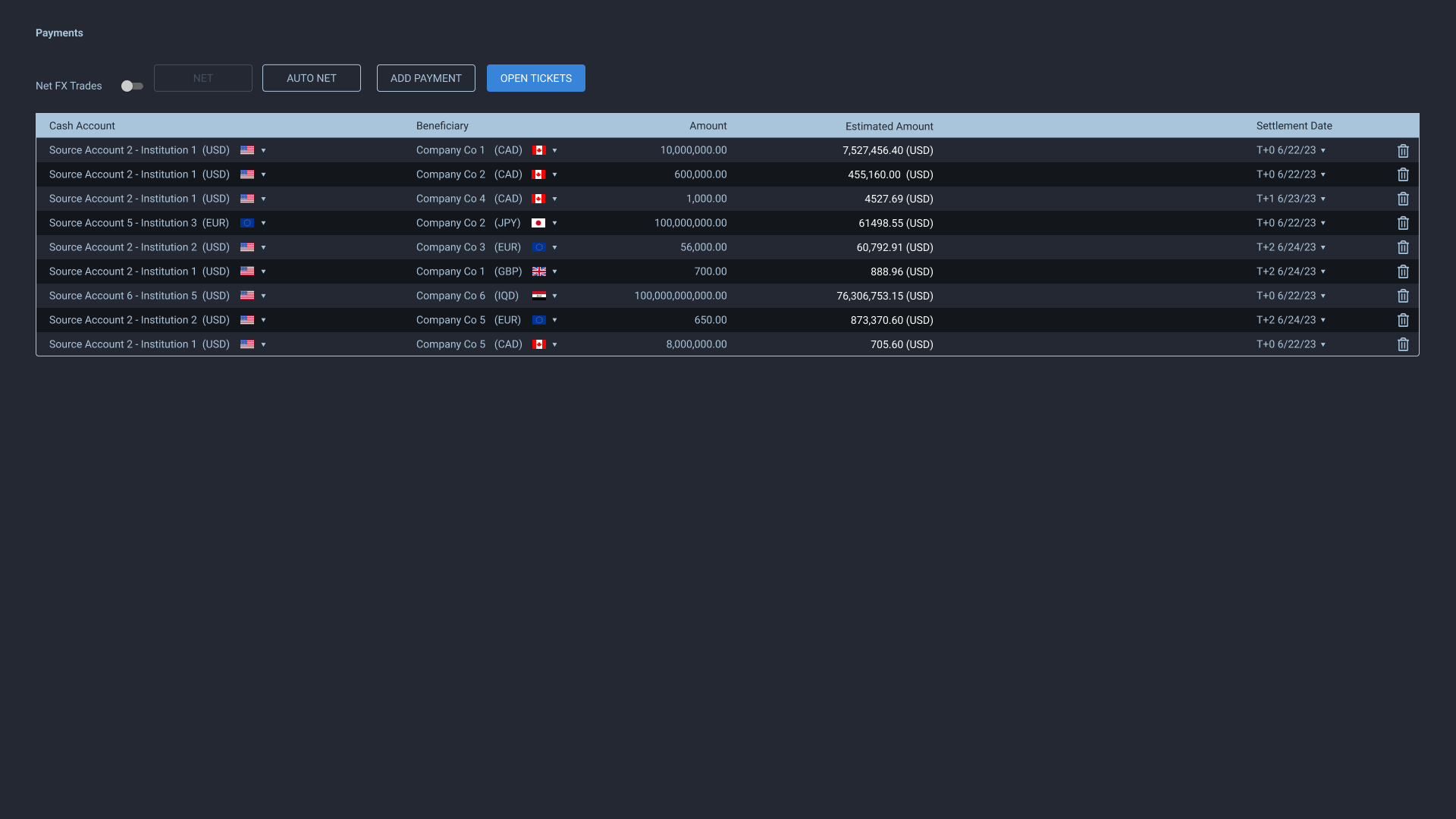
We decided to use AG Grid and expand the functionality of the application.
Focusing Novice Users While Empowering Advanced Users
Two key design details helped bridge the gap between novice and advanced users.
Account Selection Dropdown
The payment flow required users to select a funding account, but we wanted to make it easier to read and understand which account handled which currency. We included country flags and labeled the currency prominently. We also displayed the account number and SWIFT code to help increase user confidence.
This required an atypical dropdown selection design with strong visual hierarchy, prioritizing the most important information while keeping secondary details accessible.
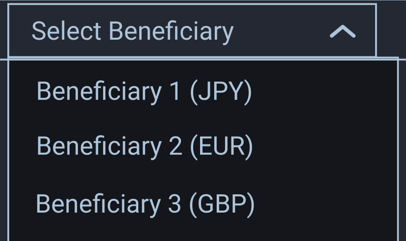
Original source account and beneficiary dropdown
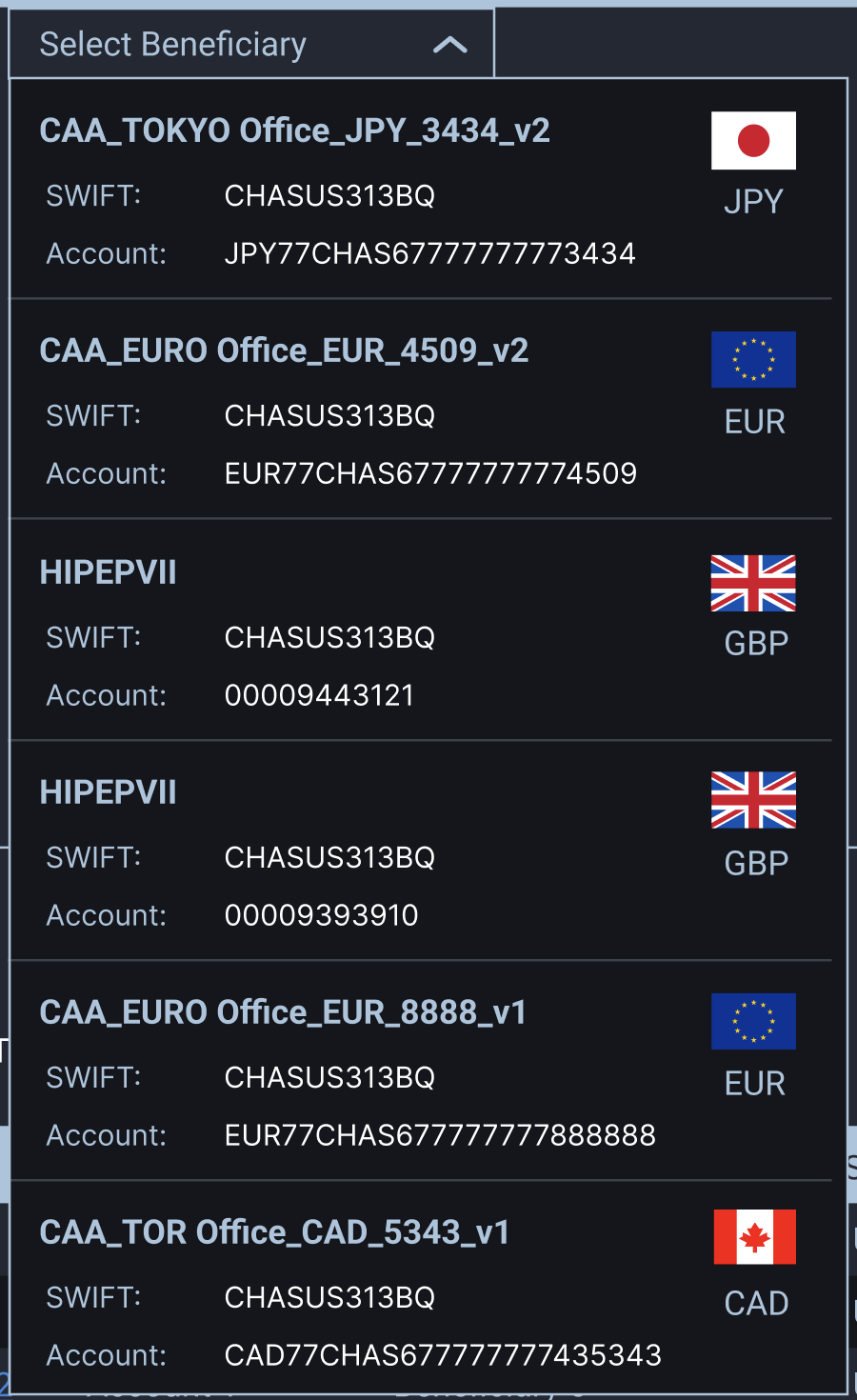
Revised account dropdowns include better visual hierarchy and readability for increased confidence
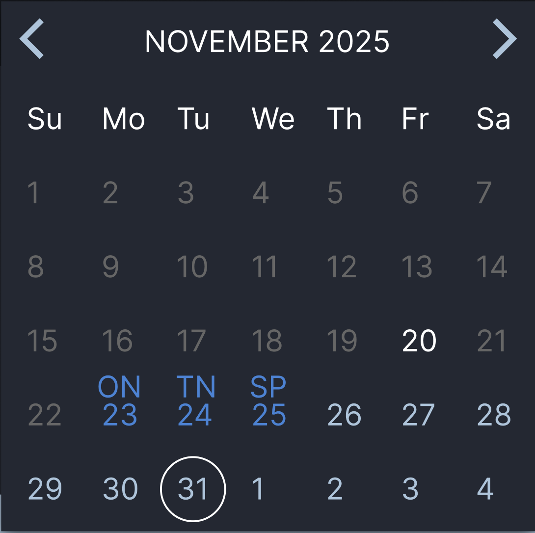
Settlement Date Picker
We designed a calendar date picker that highlighted the three standard trade date options: spot (SP), overnight (ON), and tomorrow-next (TN). Initially, we disabled all other dates, preventing users from selecting anything beyond these three options. This reduced confusion for novice users unfamiliar with FX settlement conventions.
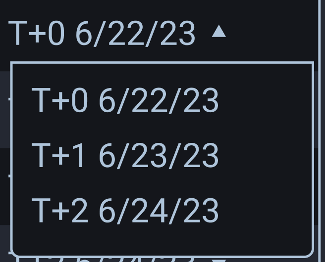
Simplistic date selector
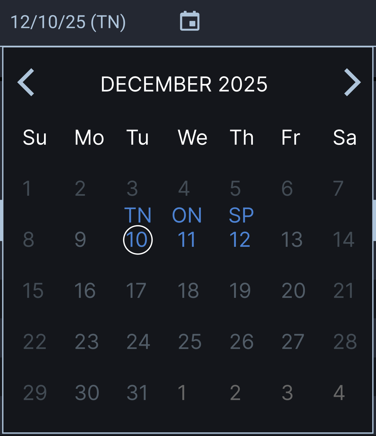
Sophisticated calendar date picker design for easier settlement date visualization that included visibility for holidays and weekends
Phase 2: Handling Multiple Payments, Approvals and Beneficiaries
Scope expanded quickly.
The system needed to:
- Support bulk/multi-payment entry
- Enable grouped FX execution
- Require separate user approvals
- Integrate SWIFT verification for beneficiaries
This introduced new challenges:
- Duplicate beneficiary names with different SWIFT/account numbers
- Overlapping source accounts across currencies
- Multi-currency grouping logic
- Risk visibility during batch operations
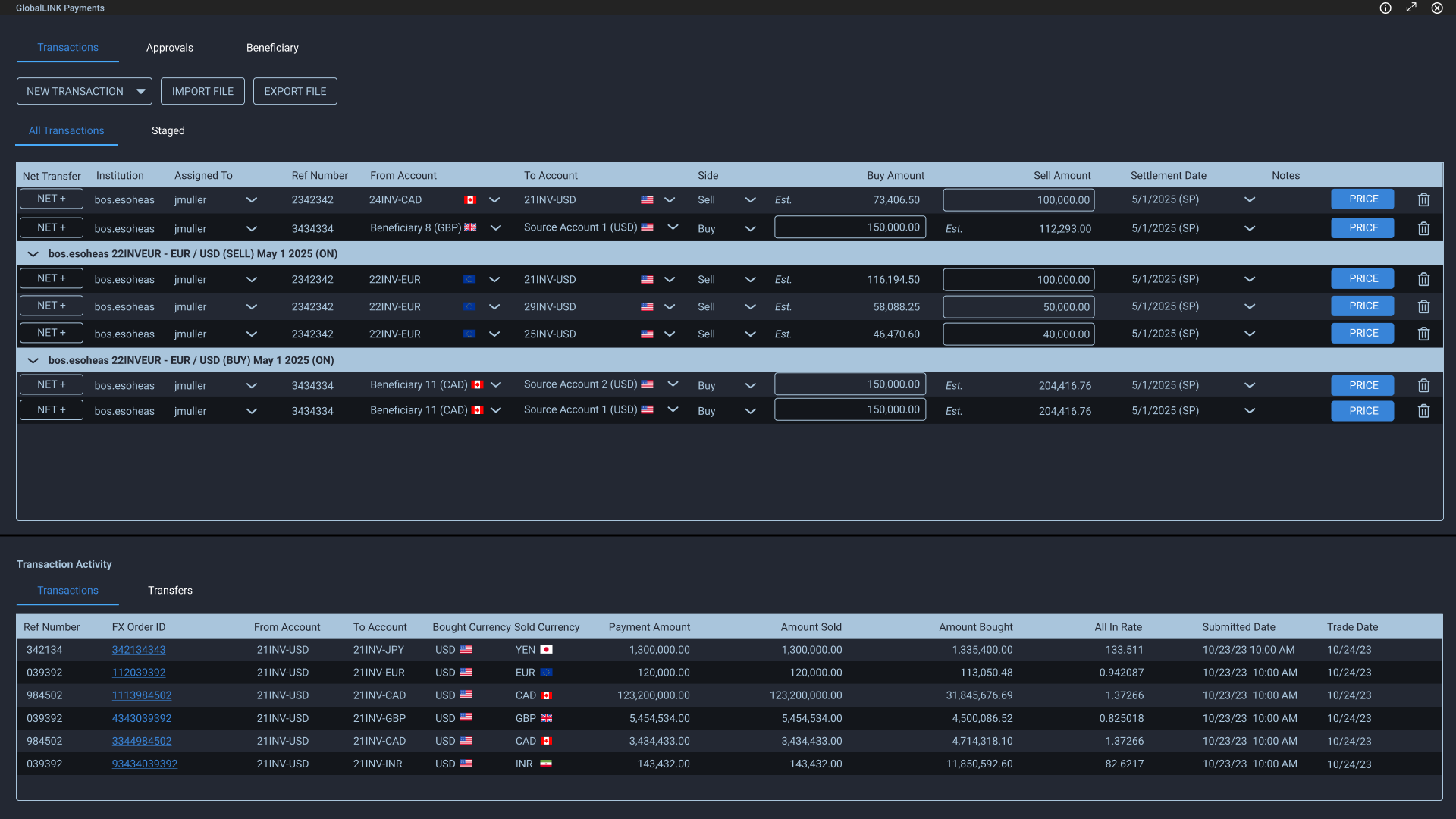
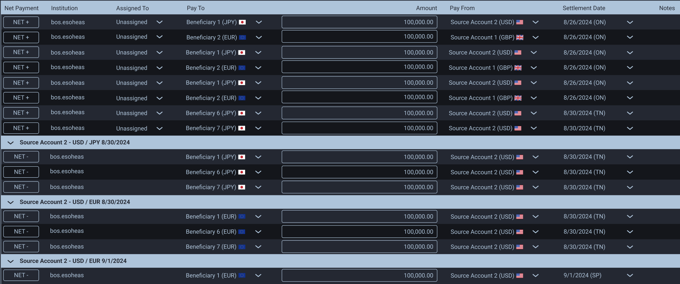
Netted Payments: Table-Based Architecture & Grouping Logic
Financial software relies on tables. Rather than fight this, I leaned into it using AG Grid’s nested grid capability, tweaked for AA compliance.
Netted payments grouped by currency, settlement date, and source account. This let users see exposure, understand funding allocation, and execute logically. I placed netted payments at the bottom of the table to avoid mixing with individual payments, using an accent-colored title bar with source account, currency, and trade date. The row could expand/collapse for visibility.
The NET CTA let users add payments to a netted group (NET +) or remove them (NET -). I chose “NET” because +/- carries other connotations in finance, and we already had a trash icon for deletion.
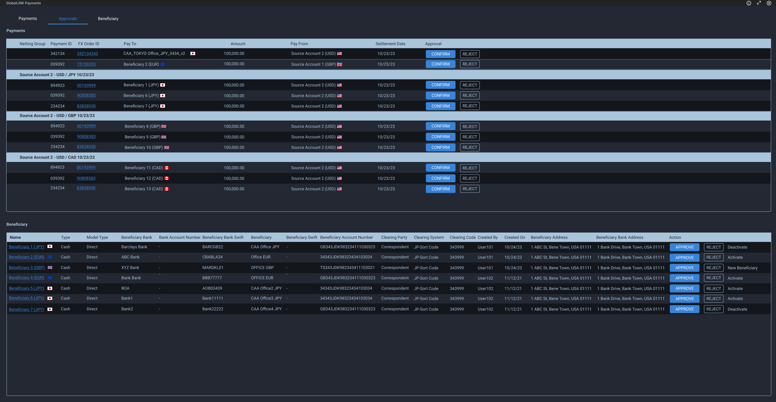
Approvals
Payments and beneficiaries required approval from a separate party. Rejections captured a reason via modal, which fed into the payment status notification.
We explored bulk approval, but regulations required individual confirmation for each payment, even within netted groups.
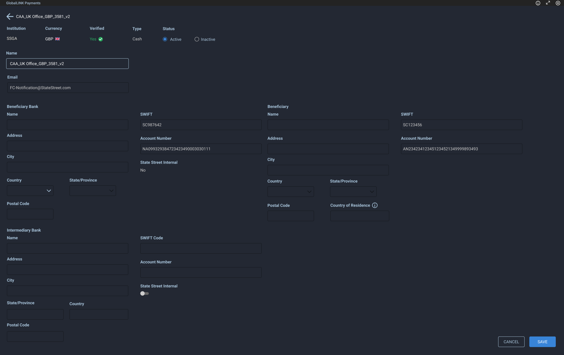
Beneficiary Management
The beneficiary form captured SWIFT codes, account numbers, and optional intermediary bank details. We implemented a real-time SWIFT validation API, which meant errors needed to surface immediately.
We used color coding and labels to distinguish errors from warnings. Single issues appeared beneath the field; multiple issues were grouped in a tooltip. It wasn’t the most elegant solution, but it tested well and the client found it helpful. Sometimes that’s enough.
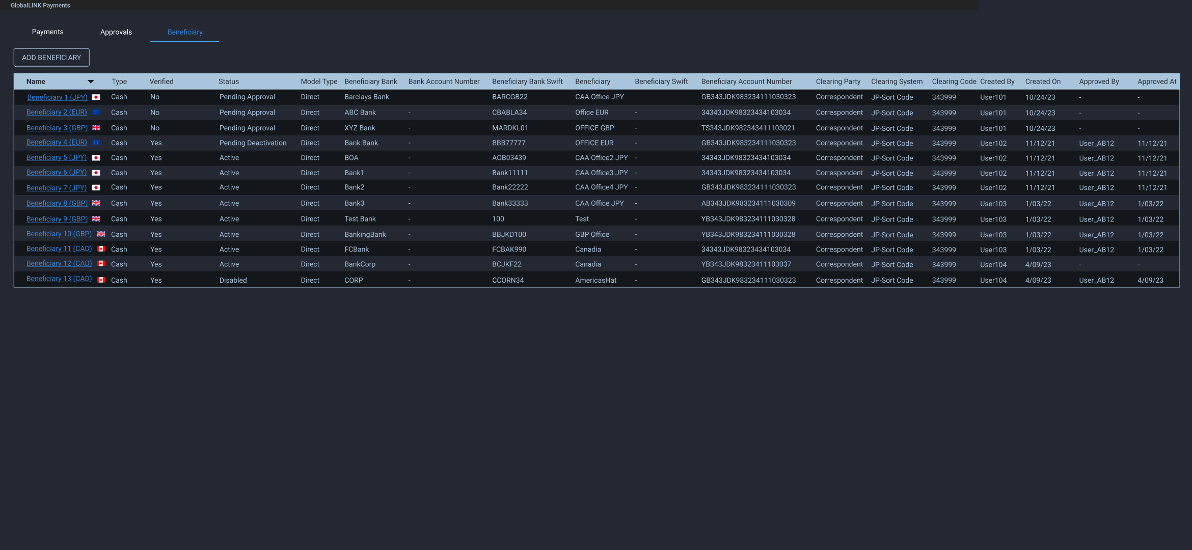
Beneficiary management leveraged AG Grid table for easy to read, manage and export a beneficiary list
Once created, beneficiaries were read-only for most users. They showed their status and account information
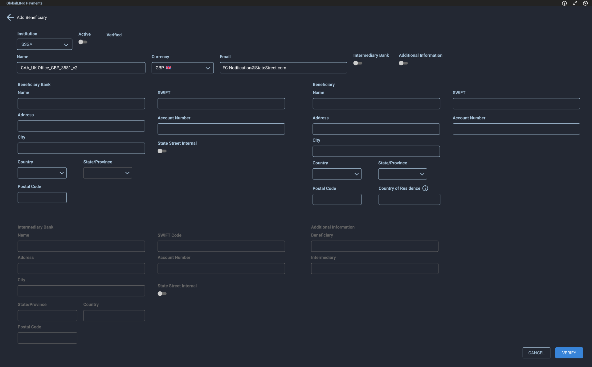
Beneficiary add form
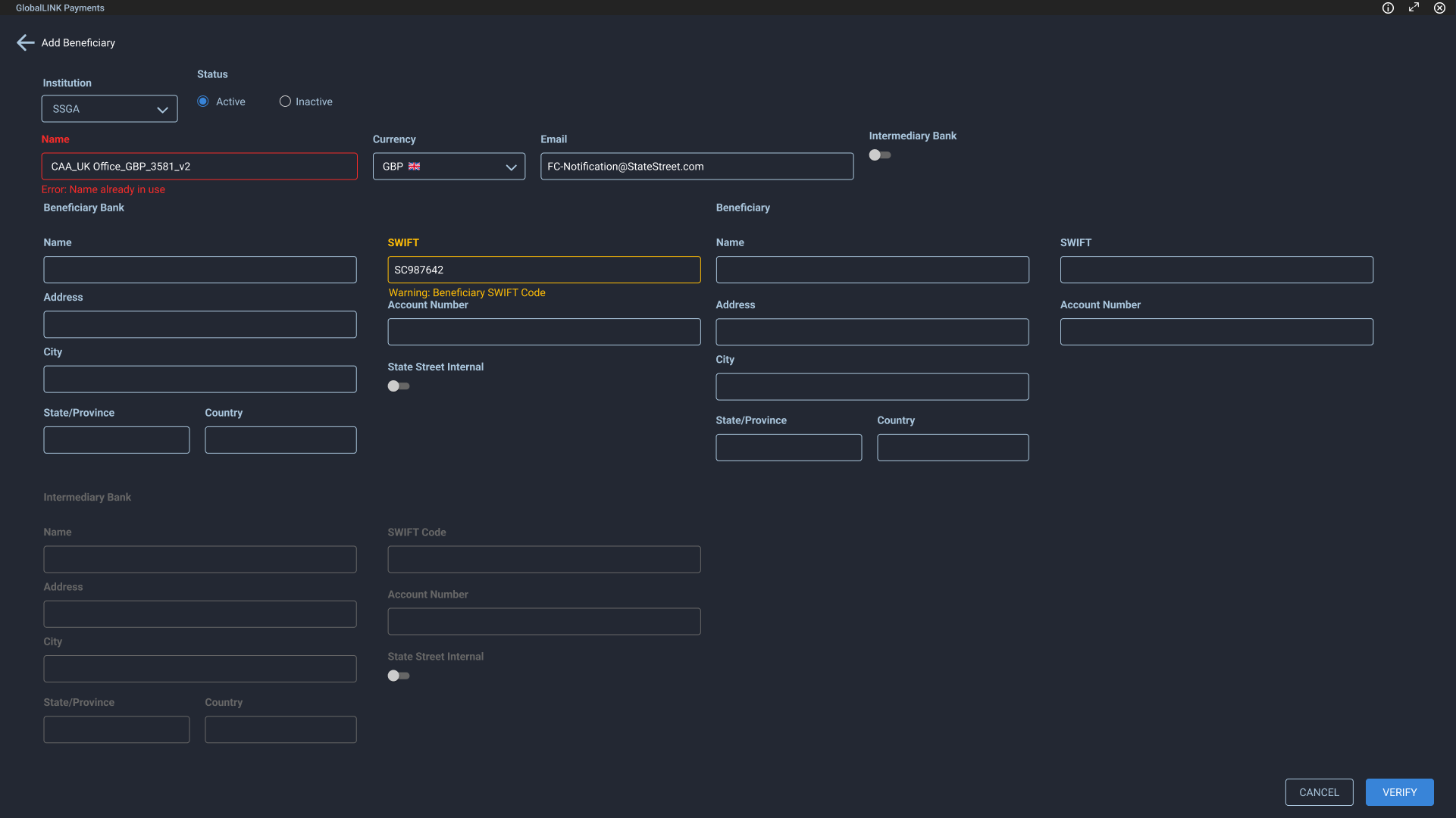
RT form validation with inline errors. Initial designs buried all errors in an icon with a tooltip but this wasn't visually efficient
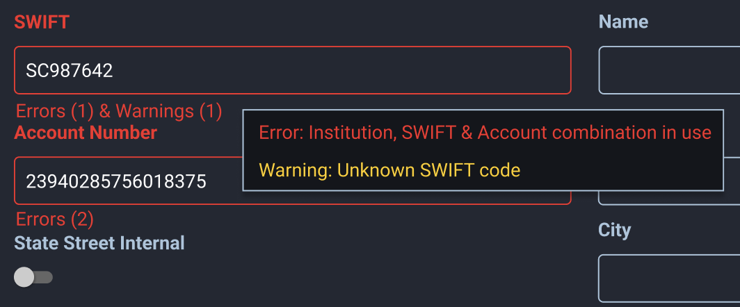
When multiple errors occurred, users could view them via hover tooltip
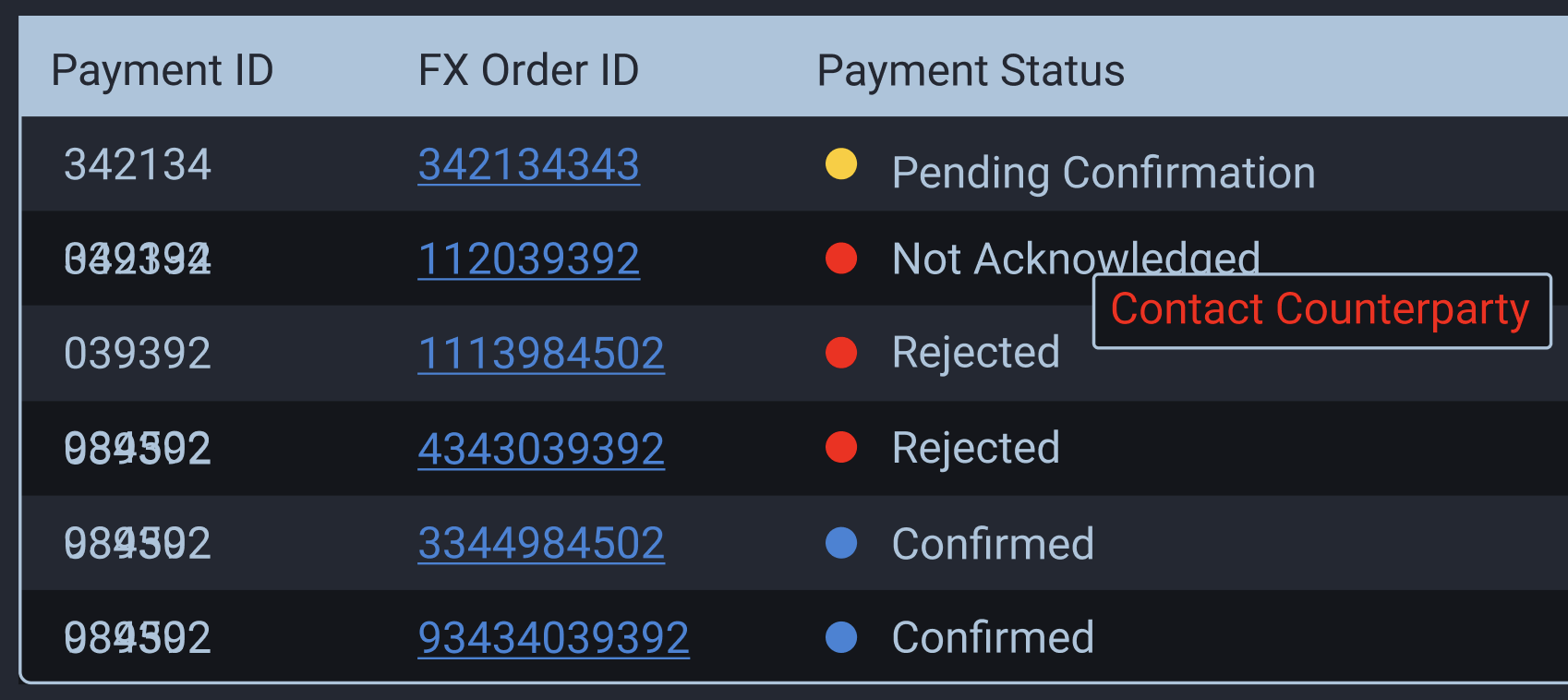
Payment Status
I designed a color-coded status system to surface payment state at a glance. When further context was needed, details appeared in a tooltip on hover.
Phase 3: Staging, Assigning, Transfers and Redemption
As the platform matured, we expanded into four additional capabilities:
Staging Clients often export payments from their own systems as CSV files, scheduled weeks or months out. Payments outside the settlement window are held in staging until eligible for pricing.
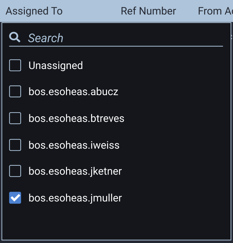
Assigning We needed the ability to assign payments and approvals to specific users and transfer ownership between them.
Transfers (Repatriation) Institutions regularly convert foreign holdings back to their domicile currency. Unlike payments (buys), transfers are sells.
Redemption Some institutions hold cash in money market funds to earn returns, which can create liquidity issues. I designed a way to display external funds were linked to a source account, letting users choose to fund payments from either the primary or a linked secondary account.
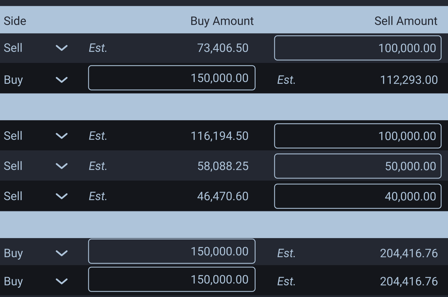
Buy and sell side amounts within the same table
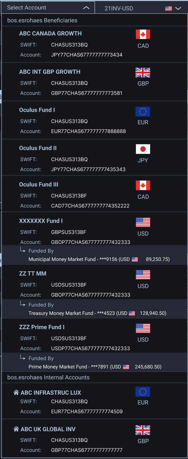
Updated account dropdowns included new sections for internal and external accounts. Accounts with redemption were designated with a 'Funded by' label and the underlying account
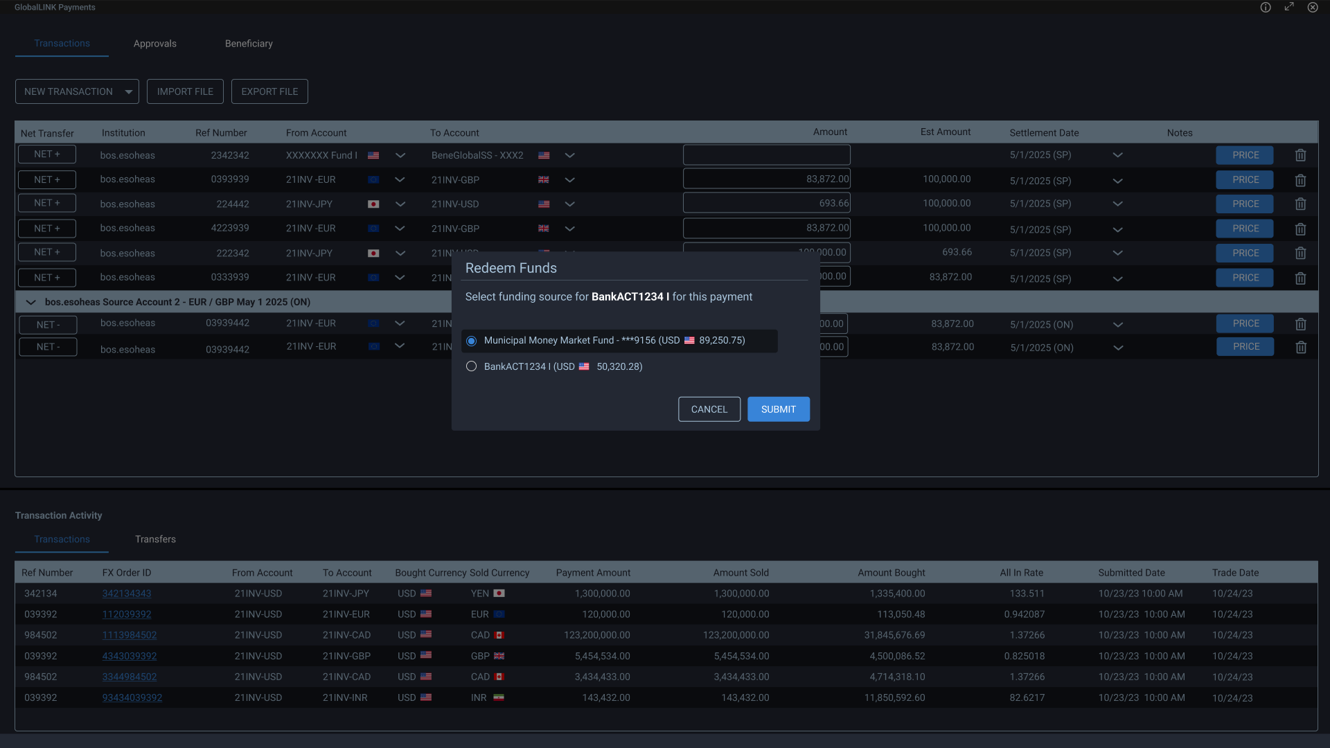
Redemption account selection modal allowed users to select which funding source they wanted
Updated calendar picker for future date selection within Staging
The Design
I wanted separate sections, but the client required a single table. We compromised: staged payments stayed separate, while transfers and assigning merged into the main payments table. AG Grid filtering let users view only their assigned payments.
For transfers, I added a buy/sell column that auto-selected based on account type, reducing cognitive load. The amount field shifted to indicate buy or sell.
Key Challenges
- Integrating fragmented backend systems into a single UX
- Designing for novice clarity and expert flexibility
- Managing duplicate naming and account ambiguity
- Maintaining financial accuracy within table constraints
- Adapting to shifting requirements without creating inconsistency
- Operating within legacy system limitations
Outcome
The unified application:
- Reduced operational friction across systems
- Simplified FX payment entry for treasury users
- Preserved control for experienced traders
- Enabled bulk and grouped execution
- Improved visibility into payment lifecycle and audit history
- Created a scalable foundation for future FX capabilities
Reflection
This project didn’t go live until April ‘26. The next step as a product team is to gather user metrics and feedback to understand error rates, efficiency, and design improvements.
This project deepened my understanding of financial software design, especially the tension between:
- Established financial paradigms
- Modern UX expectations
- Regulatory constraints
- Technical system fragmentation
Designing within these boundaries required systems thinking, negotiation, and long-term coherence, not just screen design.
The most important outcome was not a single feature. It was transforming multiple disconnected processes into a unified mental model.