Kitewheel Hub is a technical IDE originally built for engineers that enables users to create simple or complex Graphs—programmatic workflows that power integrations such as API calls, database connections, and journey orchestration.
However, the Templates and Managed Graphs features were poorly understood, hard to find, and lacked context, forcing users into inefficient workarounds.
Templates were designed to bundle reusable project components (maps, steps, graphs, nodes), allowing users to start quickly with known-good configurations.
Managed Graphs are reusable logic components—equivalent to abstracted functions in code—that can be created once and reused across workflows.
The Problem
The existing Templates and Managed Graphs UX suffered from several issues:
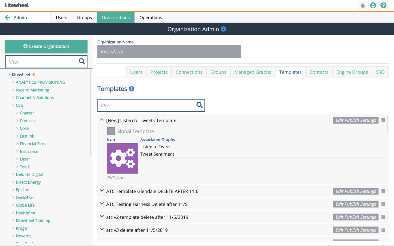
- Poor discoverability and organization — buried in the admin panel and difficult to locate
- Misleading terminology (labeled as “Sharing”), which did not match user mental models
- Lack of context — users could not see what a template contained or why it mattered
- No ability to edit or update assets once created
- A painful update process for Managed Graphs, requiring manual edits across hundreds of instances
As a result, users distrusted the feature and relied on error-prone copy-paste workflows instead of reusable abstractions.
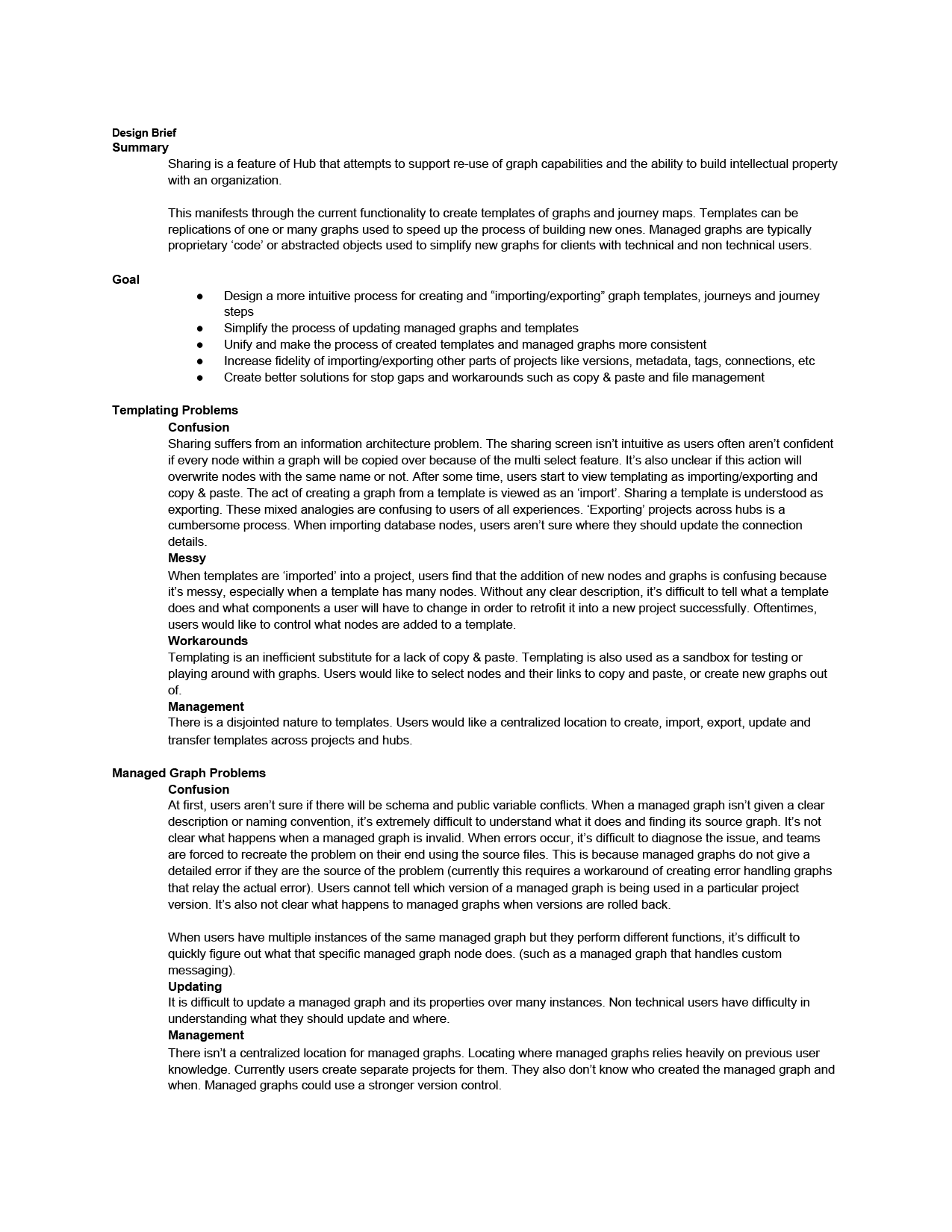
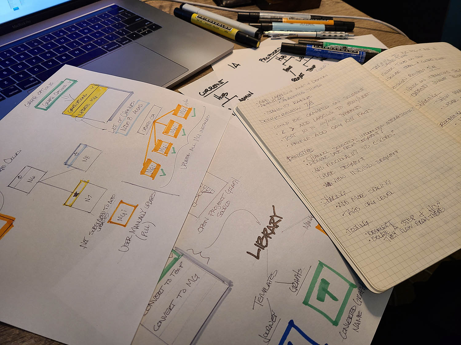
I always start out each project with a design brief. This is a nice stake in the ground that defines the problem, the goals, the MVP and the timetable
The Challenge
- Clarify the purpose and structure of Templates and Managed Graphs to align with user expectations
- Create a centralized location to view, manage, and reuse abstractions across projects and teams
- Make it clear what is included in each template or managed graph and how it relates to workflows
- Reduce friction around importing, editing, updating, and sharing reusable components

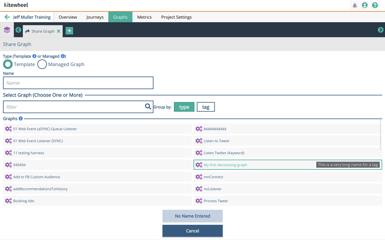

Templates and managed graphs were buried in the settings. It was impossible to tell what functions they performed or where they came from. When templates were imported into a project, names often overlapped and it wasn't easy to discern the difference unless they were clearly tagged which wasn't often the case.
The Strategy
I applied a design-thinking approach:
- Research & investigation — interviewed both technical and non-technical users to understand mental models and pain points
- Define & ideate — clarified what Templates and Managed Graphs should be versus how they were perceived
- Design & prototype — created and iterated on a new Library UX that treated templates and managed graphs as first-class reusable assets
- Test & refine — validated assumptions with users and refined solutions based on feedback

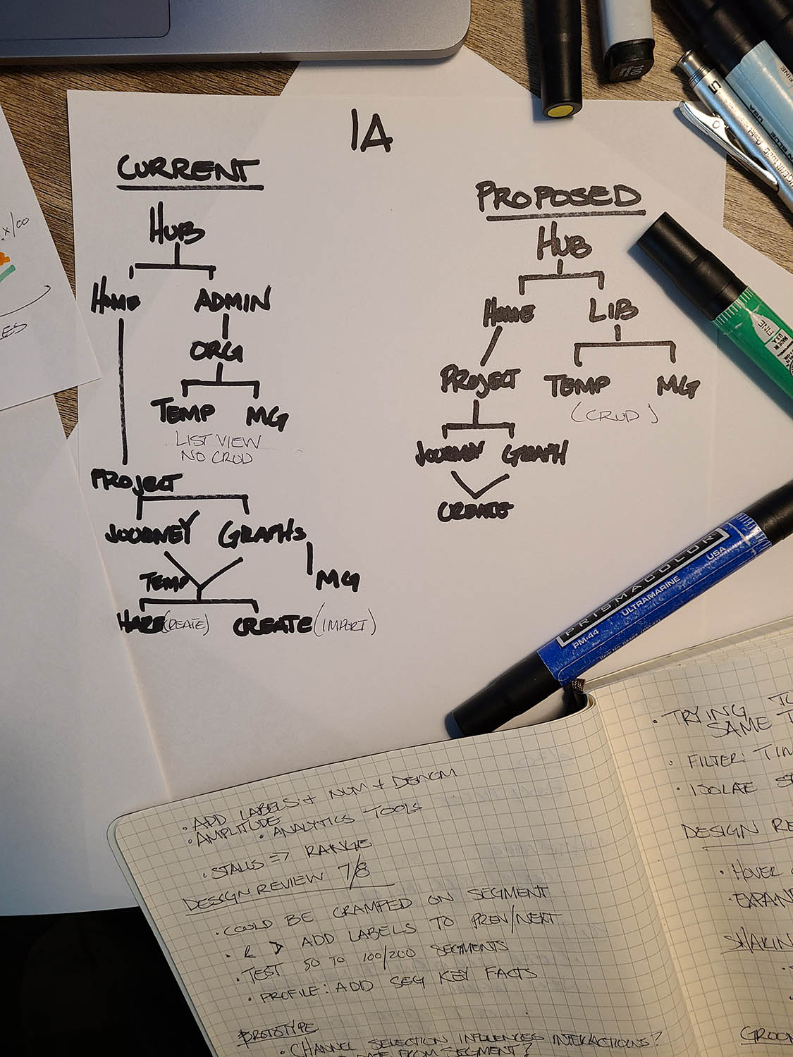
Once problems, goals and users are well defined I like to create the information architecture based on the concept I'm envisioning. From there I begin to sketch out the flow and design details. Different concepts will require different IAs, however, I prefer to orient IAs in a categorical or ontological sense. When features are properly categorized and organized, it allows the design to be much more intuitive.
The Solution
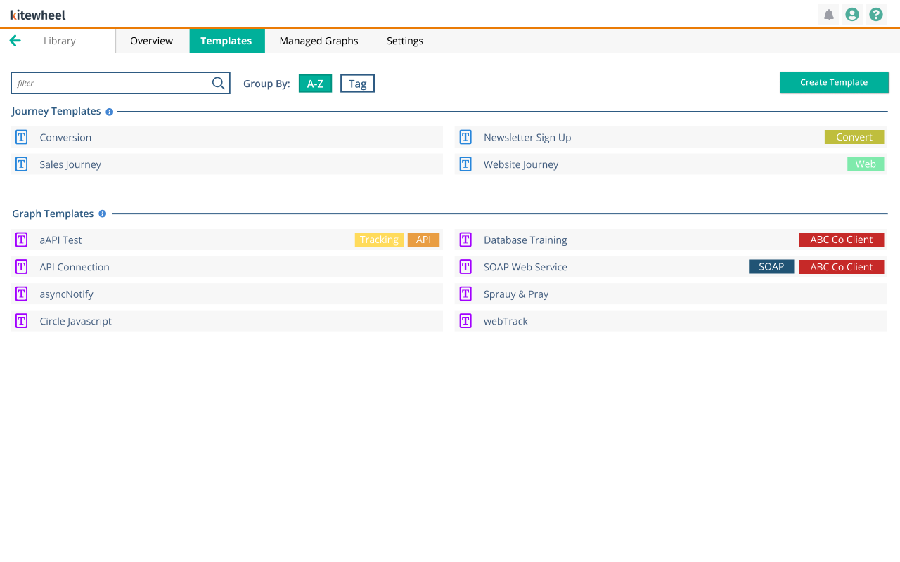
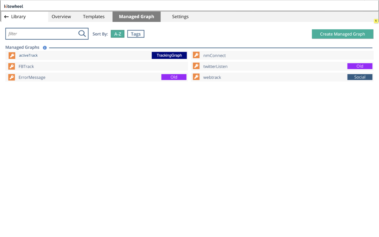
We replaced the confusing “Sharing” concept with a Library—a centralized UX for creating, viewing, editing, importing, exporting, and managing reusable assets.
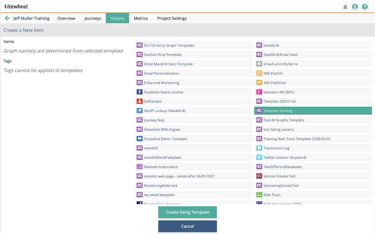
- Users can create Templates and Managed Graphs directly from the graph editor or from the Library
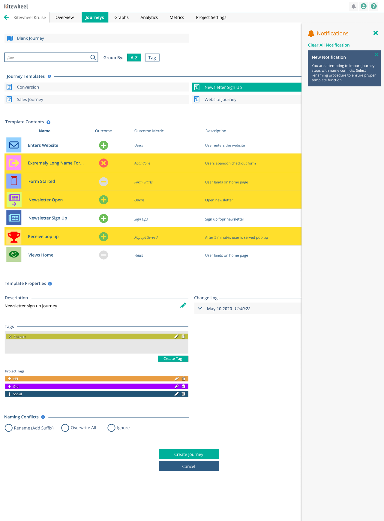
- The Library clearly surfaces what each asset contains, including nodes and sub-graphs
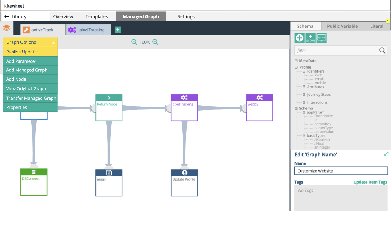
- Managed Graphs use a push/pull update model, allowing users to update logic once and propagate changes automatically from the graph itself.
- Tagging and organization tools make assets easy to find, filter, and reuse


Once I have a clear vision and think through large questions in my sketches, I will move to prototyping. Typically in Axure but these days I use Claude. In this concept, I used the library paradigm which stored managed graphs and templates. In the second image, users can create a template or managed graph from any project they're working on. In the library, they can edit and push changes to any template or managed graph within the entire system.
Results
The new Library significantly improved how users understood, found, and reused Templates and Managed Graphs.
- We tested 8 different users of varying techinical skill. Testing included 1 hour sessions of pass/fail and qualitative feedback
- We went through two rounds of design refinement in order to fix some gaps such as importing templates. It wasn’t immediately clear if elements would get overwritten, and we introduced auto tagging to show what was new
- Users immediately recognized the Library as the destination for reusable logic
- Creating and editing templates became intuitive, especially when done in the context of active graphs
- The push/pull update model saved hours of manual work across hundreds of graph instances
- Tagging and metadata improved predictability and confidence when reusing assets
This transformed Templates and Managed Graphs from obscure features into composable UX building blocks that support long-term reuse and platform scale.


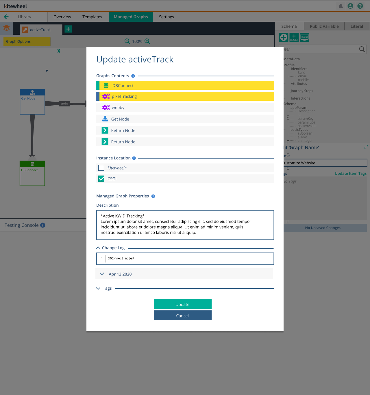
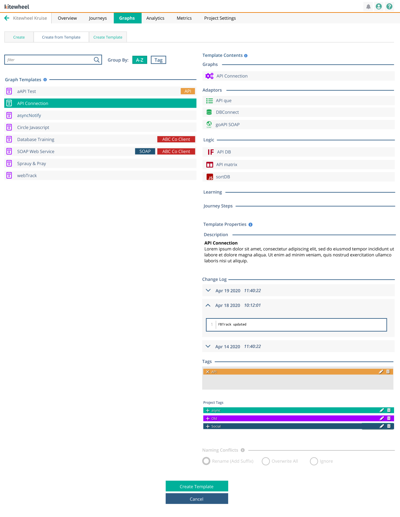

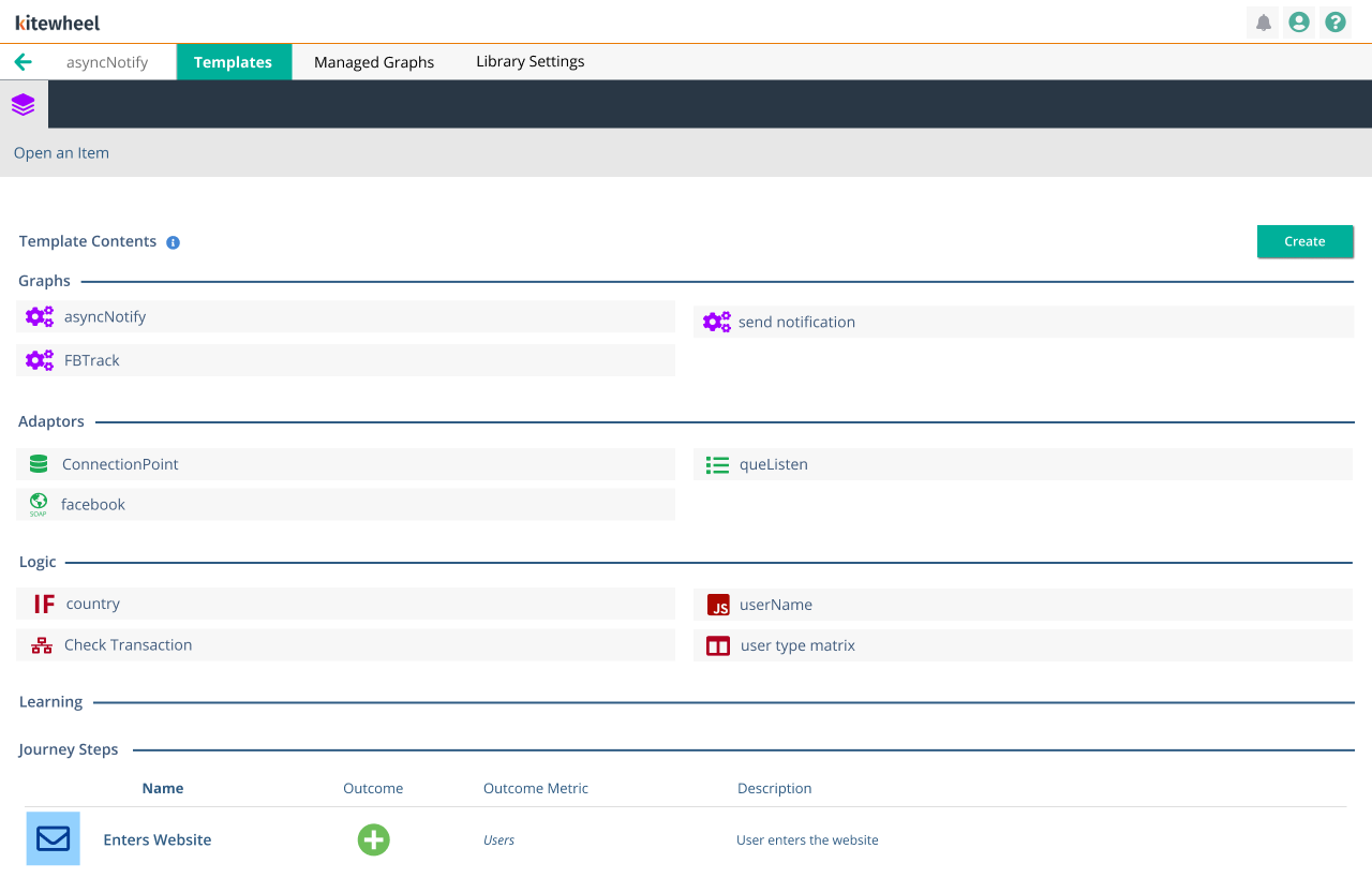
The library IA had a section for Templates and Managed Graphs. When a Managed Graph needed to be updated for code changes, a user would open up the intended graph, make the change, and push that change to any or all projects that used that graph. It showed what code was changing, required notes, and provided a change log. When users were creating a project, and wanted to use a template from the library, they would import the template and could read the description and contents of the template.
Engineering Collaboration
With limited engineering resources, I partnered closely with the development team over eight months to define MVP scope, refine interactions, and ensure deliverability without sacrificing design intent. An iterative sprint process balanced product goals, technical constraints, and user needs.
Project Gallery