Summary
A navigation redesign for an outdated CRM used by real estate agents. The challenge was designing for technically proficient users who resist change unless it’s seamless and intuitive. The result: a unified navigation that tested well and shipped in under a month.
The Problem
The existing navigation was a patchwork of bolted-on features with no coherent structure:
- Global nav with hover-style dropdown menus
- 8 different sub-navigation types and styles
- A “Gear” icon that became a dumping ground for features that didn’t fit anywhere else
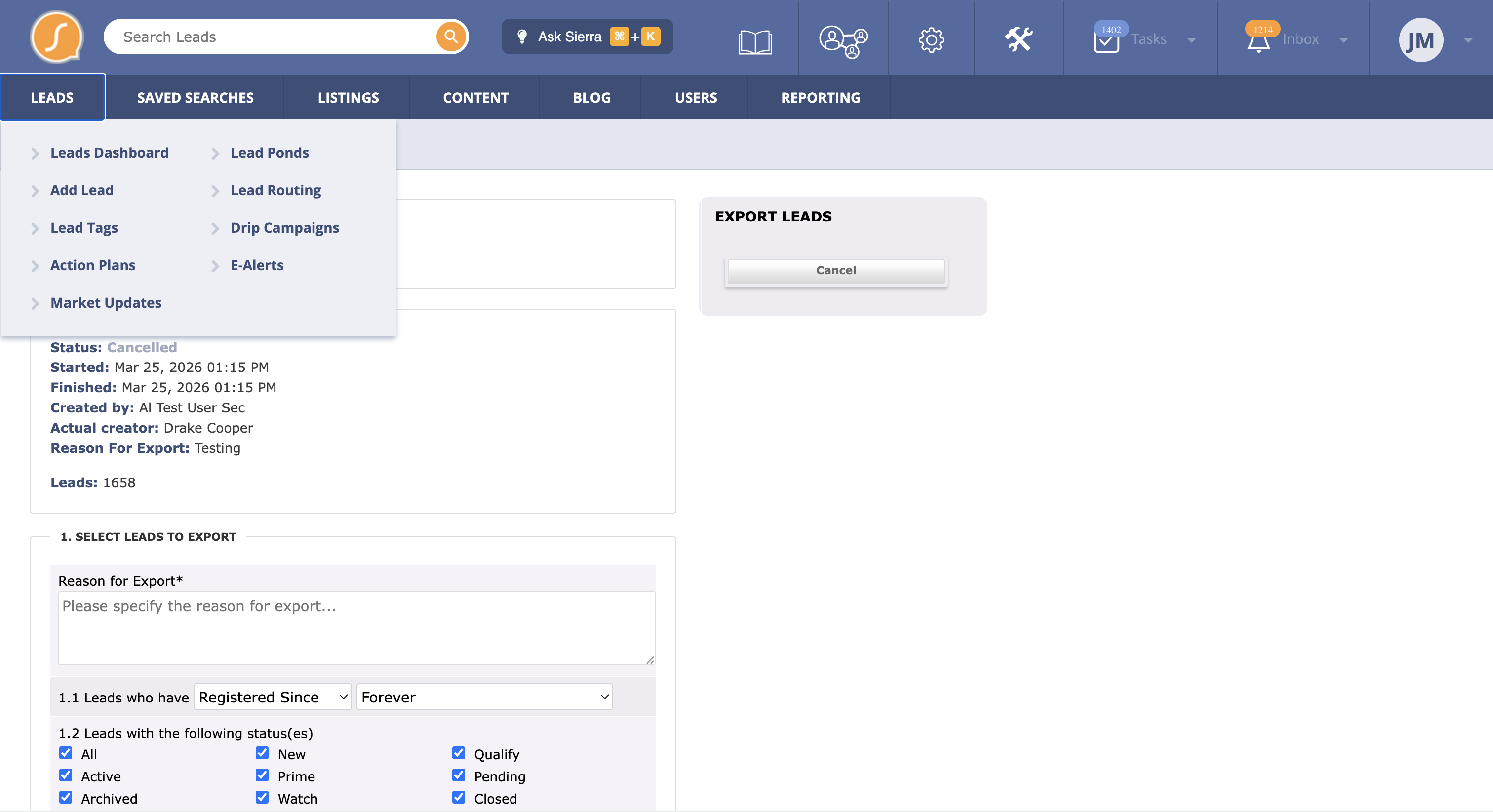
One of the primary goals was to eliminate the Gear icon entirely.
Hover over dropdown menu
Hover over dropdown menu variant
Hover over dropdown menu variant
Gear icon became a dumping ground for miscellaneous features
Sub-navigation style 1
Sub-navigation style 2
Sub-navigation style 3
Sub-navigation style 4
Sub-navigation style 5
Discovery: Taxonomy and Information Architecture
Once the product manager provided a basic PRD and walkthrough, I started with a complete taxonomy of the site.
I documented everything in a spreadsheet:
- Information architecture
- Job to be done for each page
- Page descriptions
- Content inventory
- Notes and questions
I also took an accounting of each navigation type, documenting where and how each was used.
Sample: Old Navigation IA
| Page/Component | Job to Be Done | Content | Questions | Notes |
|---|---|---|---|---|
| System Navigation | RE CRM Co. Feature Announcements, Help, Third Party Apps, Cog, Tools, Tasks, Inbox, User | Cog and tool icons should be reversed. Home is hidden. | ||
| RE CRM Co. Announcements | Understand feature updates | RE CRM Co. academy, knowledge base, getting started, live training, support contact | Does this need to be here? | Holiday hours announcement isn't part of this? |
| System Navigation: Help | Join the mastermind? | What happens when I close that? | ||
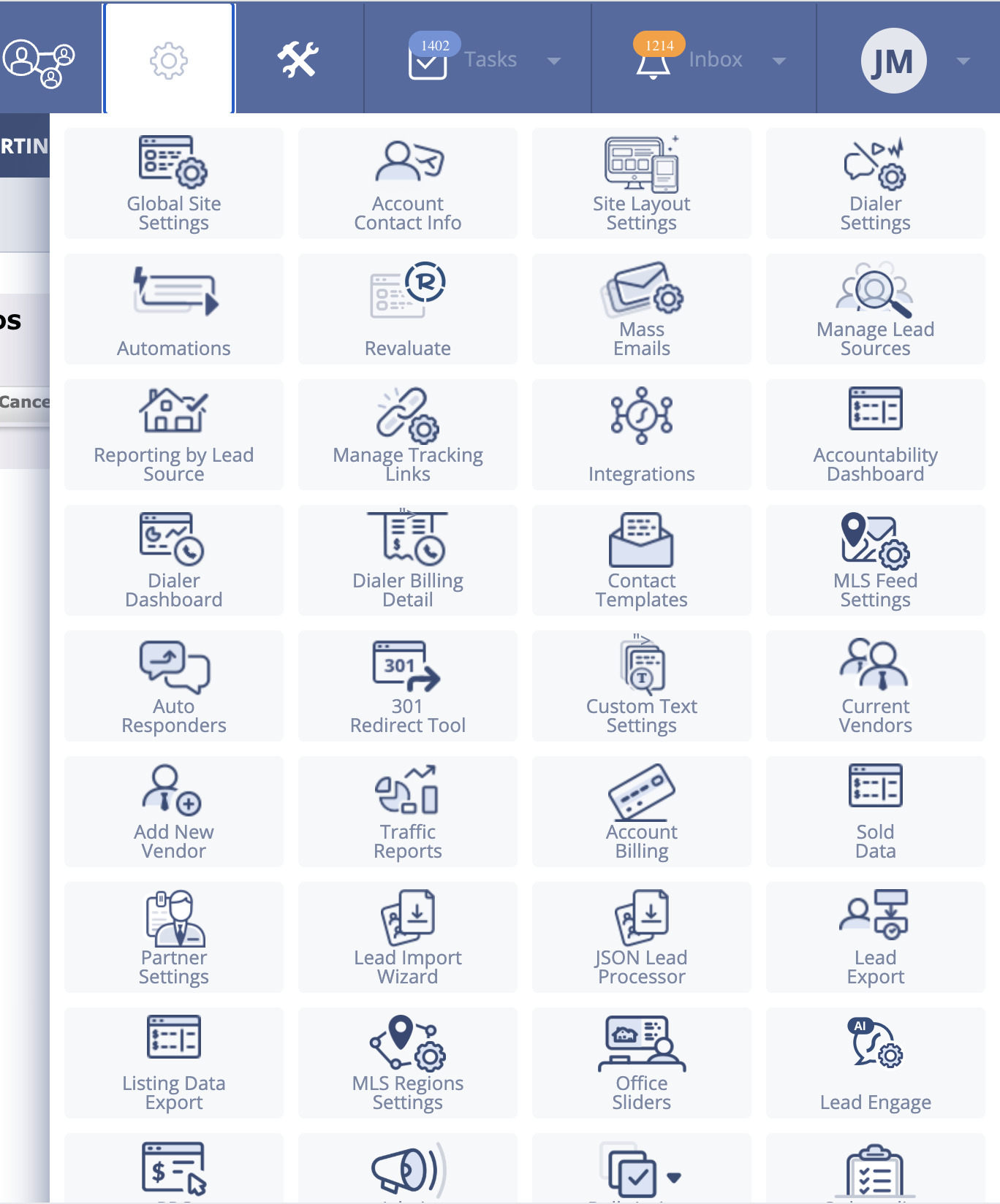
| System Navigation: Cog | Global Site Settings, Account Contact Info, Site Layout Settings, Dialer Settings, Automations, Revaluate, Mass Emails... | 40+ items dumped here |
Sample: Cog Icon Contents and Proposed Relocation
| Cog Item | Description | Proposed Location |
|---|---|---|
| Global Site Settings | Web | |
| Account Contact Info | Business info, contact info, logo | Web |
| Site Layout Settings | Web | |
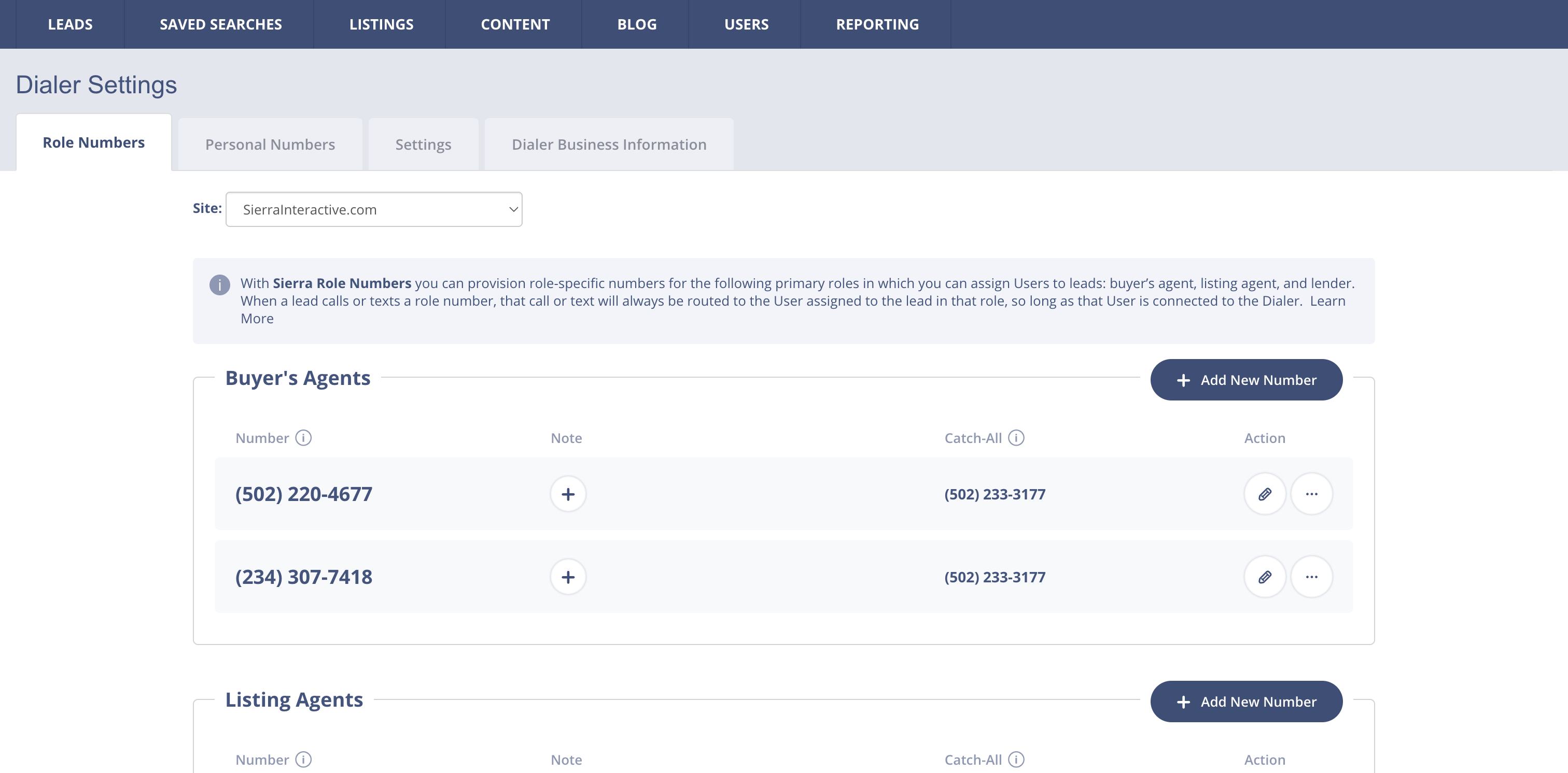
| Dialer Settings | Phone numbers to funnel to agents/lenders | Settings |
| Automations | If-then automation list | Lead |
| Revaluate | Lead analysis | Lead |
| Mass Emails | Mass email analysis | Lead |
| Manage Lead Sources | Adding sources with custom labels | Lead |
| Reporting by Lead Source | Analysis of sales by source | Analytics |
| Integrations | API and 3rd party connections | Settings |
| Accountability Dashboard | Agent analytics | Team |
| Contact Templates | Templates for messaging | Lead |
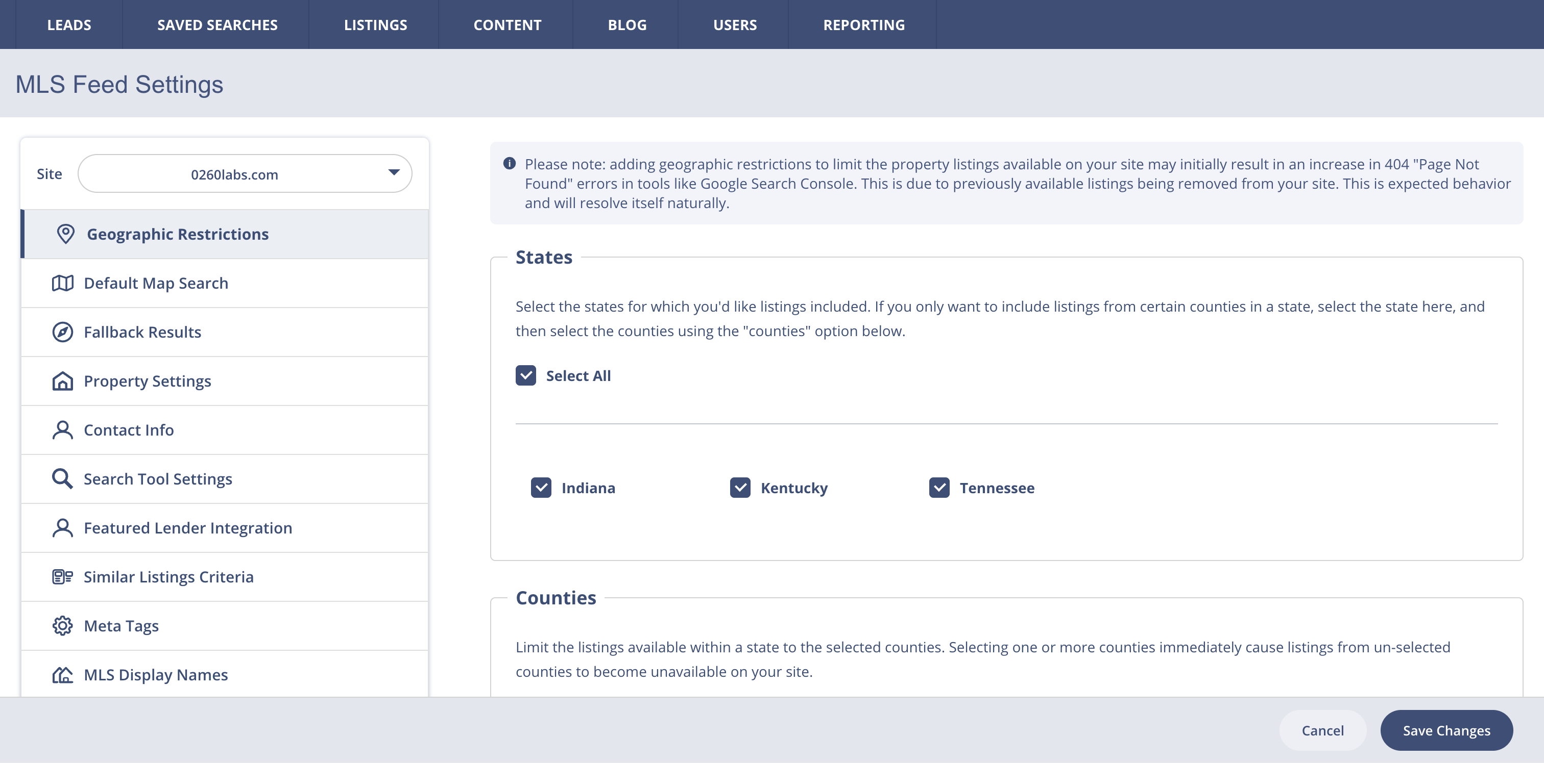
| MLS Feed Settings | Web | |
| Auto Responders | Response mechanism for web | Web |
| Sold Data | Home sale data | Analytics |
| Lead Import Wizard | Lead | |
| JSON Lead Processor | Lead | |
| Lead Export | Lead |
Exploration: Two Navigation Models
I explored two navigation variations:
-
Persona-driven - Organized around user roles
- Agent roles - Primarily focused on landing and chasing leads
- Manager roles - Created e-alerts, action plans, and campaigns
Larger agencies tended to have bifurcated roles, making this a viable option.
- Workflow/Tools - Organized around tasks and capabilities
After deliberation with the team, workflow/tools emerged as the stronger option. While persona-driven worked well for large agencies with dedicated roles, most users wore multiple hats and needed access to everything. Workflow/tools scaled better across agency sizes, but we needed user validation.
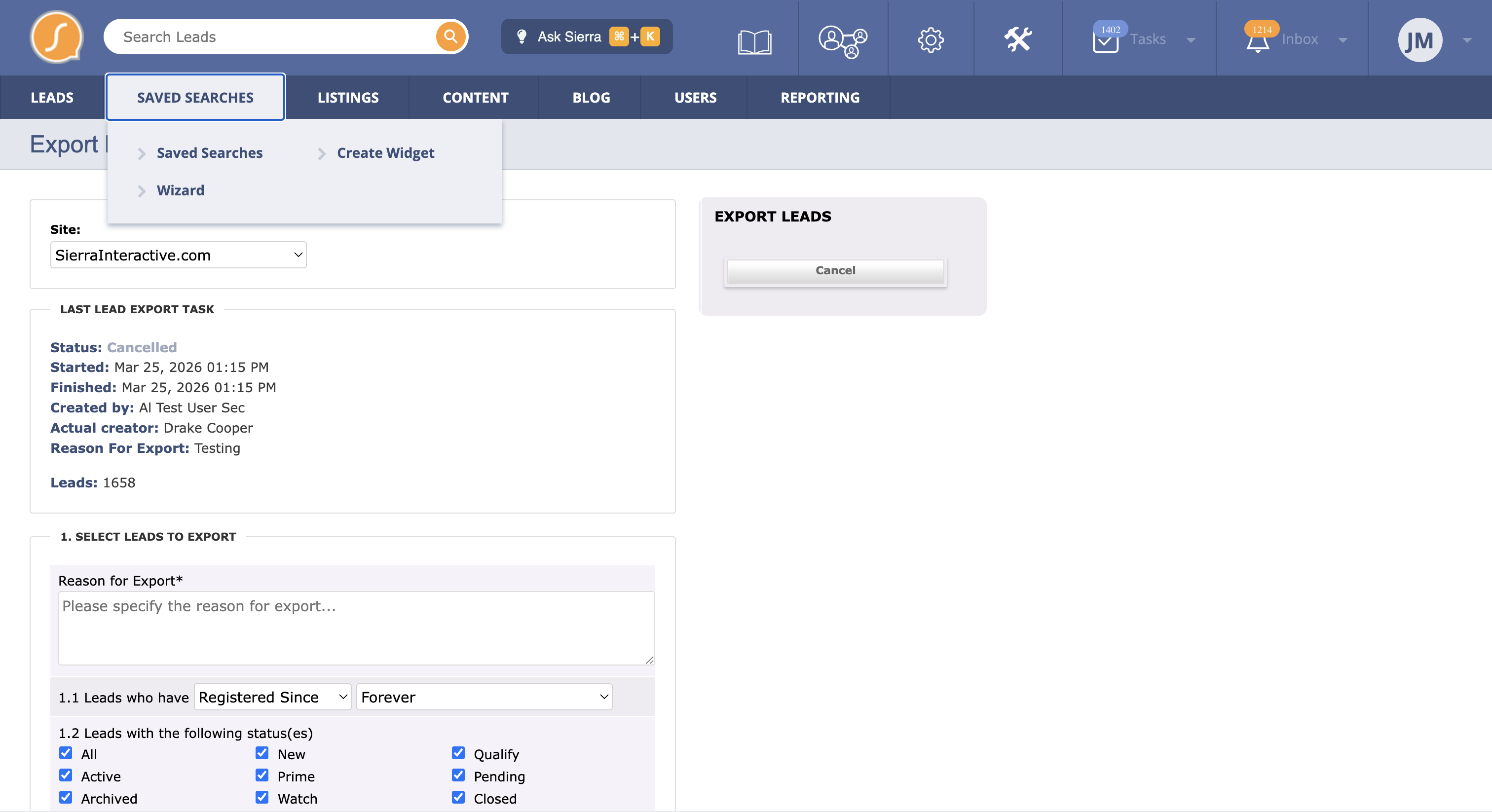
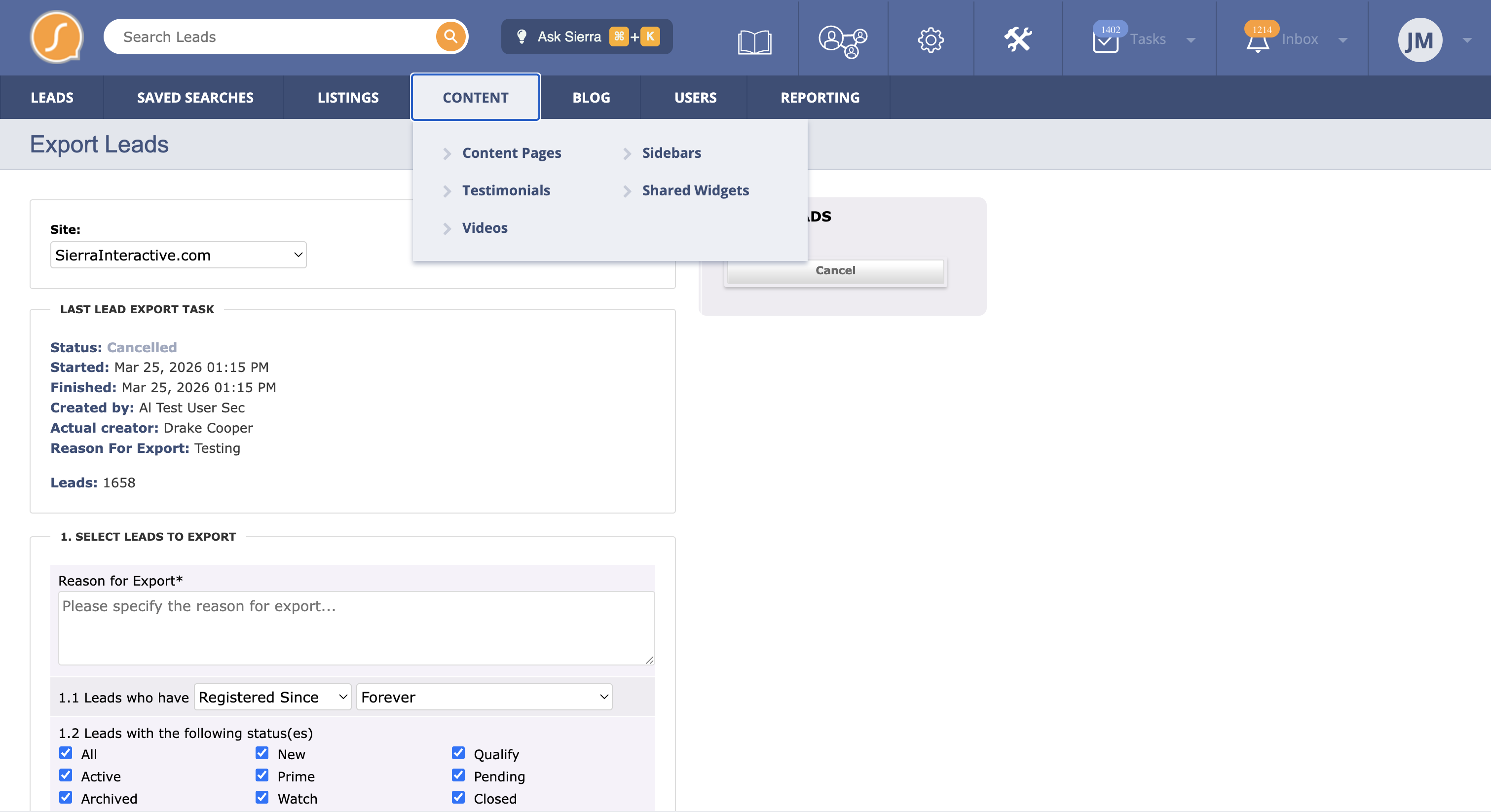
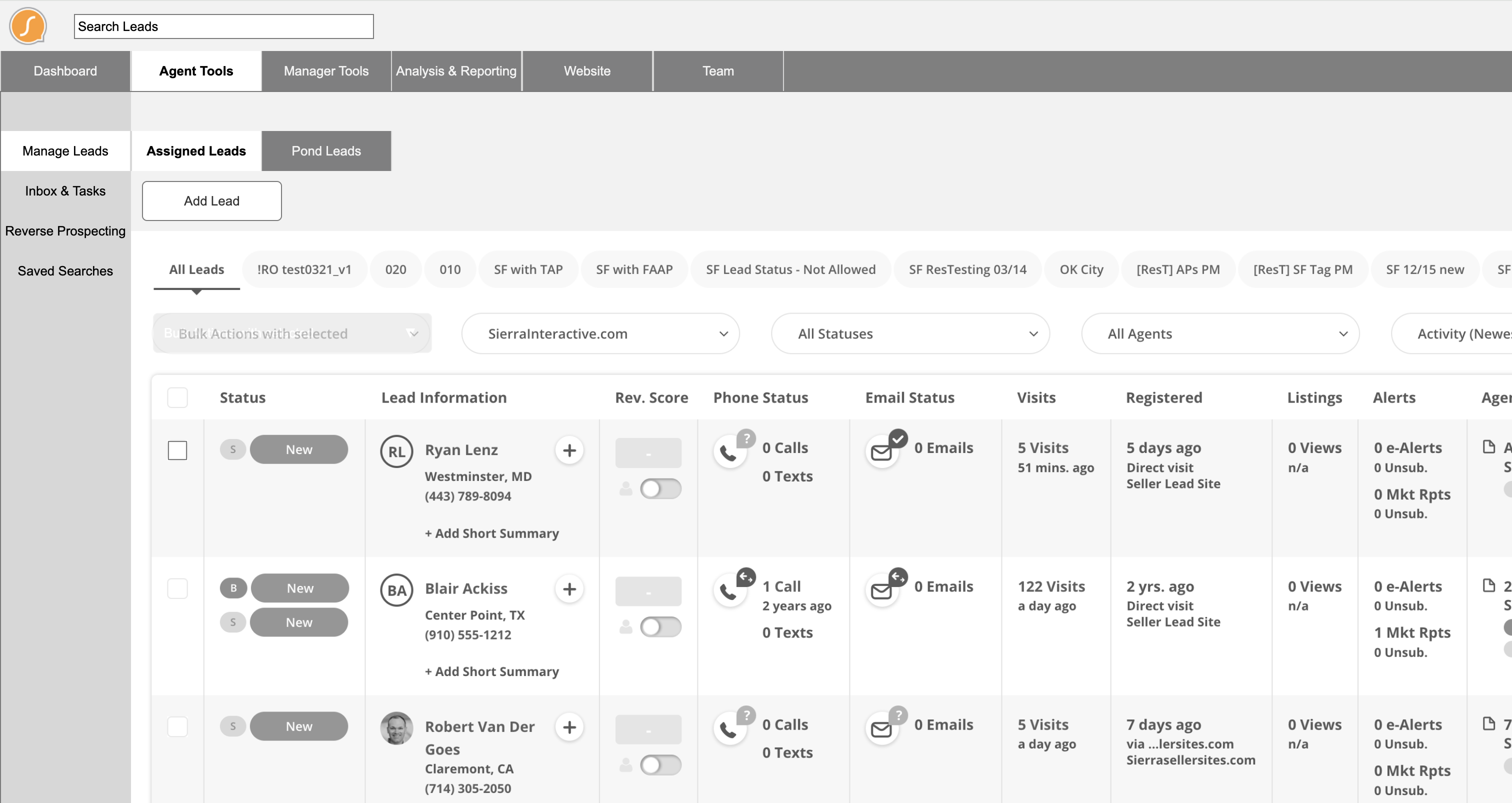
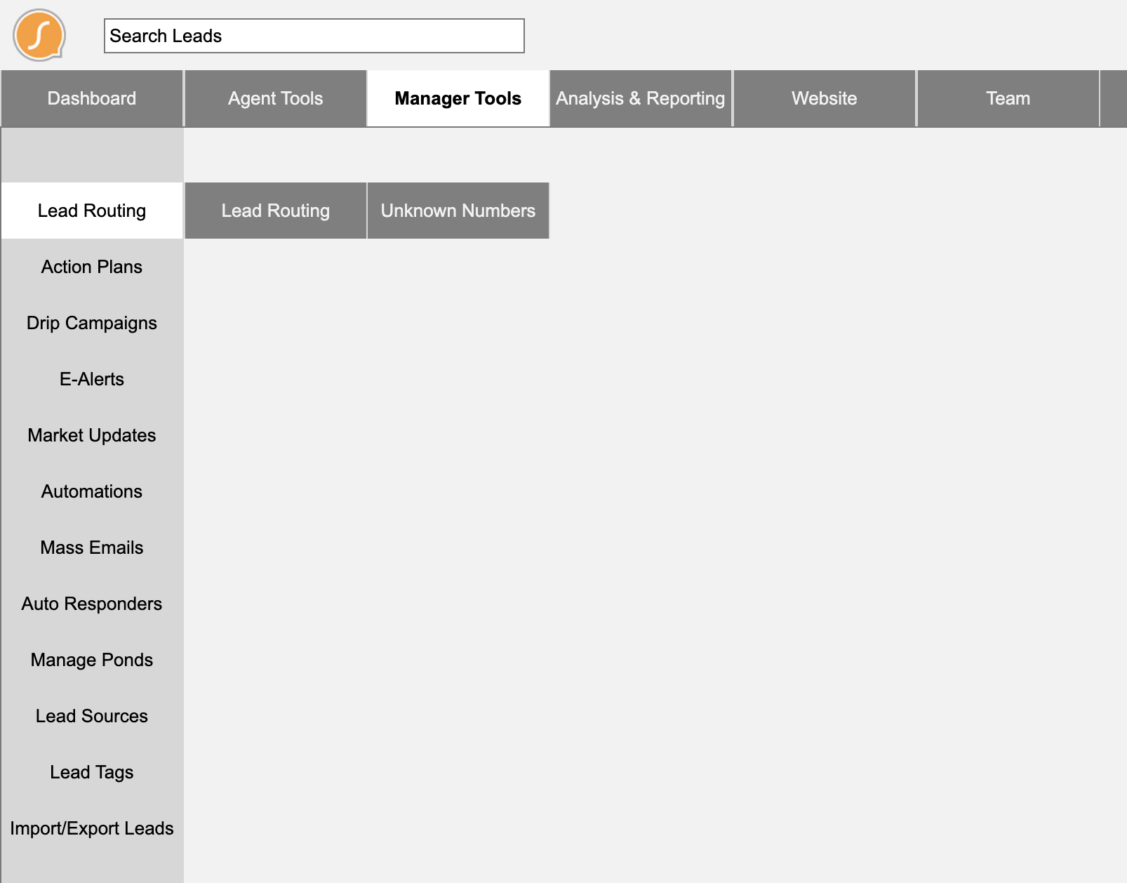
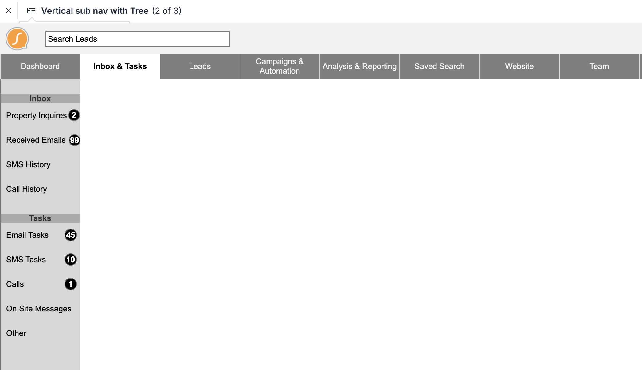
At the same time, I consolidated the 8 navigation paradigms down to 2: global tabs and side tabs. Simplifying UI components makes engineers’ lives easier. I chose tabs because they’re a well-established design pattern, clean, and accessible even to less proficient users. But I mainly used tabs because the original menu buttons read like tabs, which means they were already part of the pattern library. The only change I made was to reduce their height by 30px in order to give the content more room. This nip tuck occurred within sub tabs and the top bar, which resulted in an extra 90px of real estate.
Proposed IA Structure (Workflow/Tools)
| Tier 1 | Tier 2 | Tier 3 | Type | Location Change |
|---|---|---|---|---|
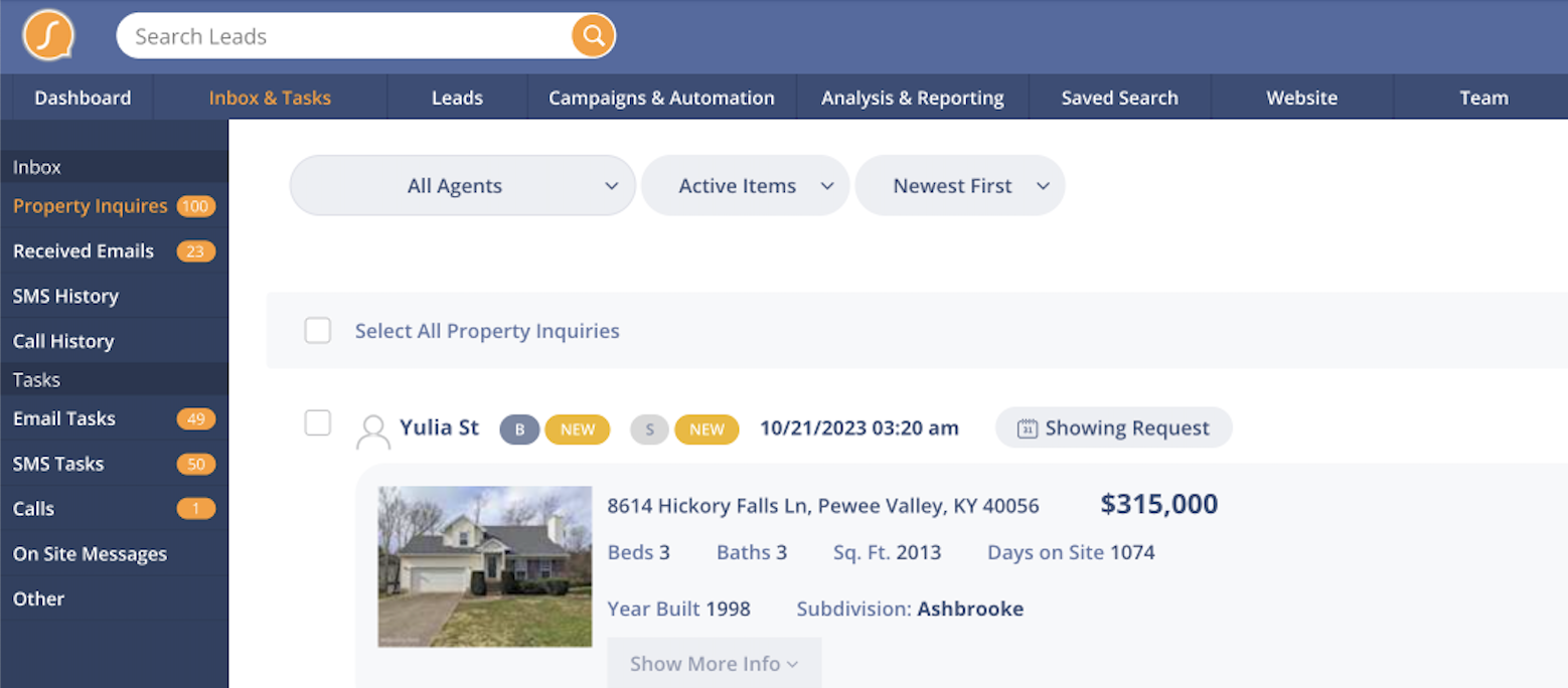
| Global Nav | Dashboard, Inbox, Leads, Campaigns & Automation, Analysis & Reporting, Web, Team, Settings | Tabs | ||
| Inbox & Tasks | Tasks | Side Tab | Combined into new page | |
| Side Tab | Combined into new page | |||
| Text | Side Tab | Combined into new page | ||
| Voicemail | Side Tab | Combined into new page | ||
| On Site Messages | Side Tab | |||
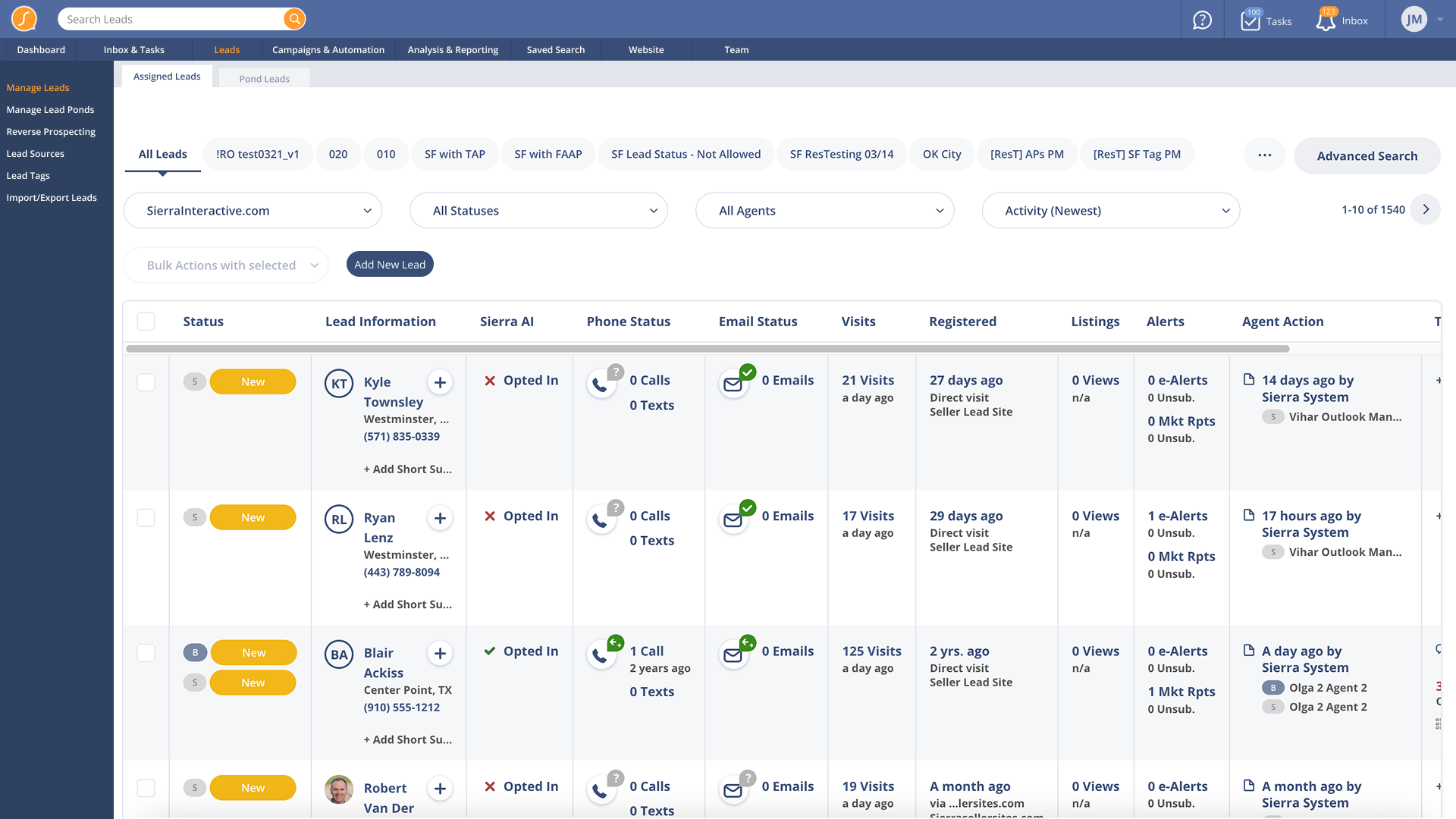
| Leads | Manage Leads | Assigned Leads, Pond Leads, Add Lead | Side Tab / Sub Tab | |
| Manage Ponds | Summary, Agent Activity, Lead Pond Settings | Side Tab / Sub Tab | ||
| Reverse Prospecting | Featured Listings, Potential Listings, Listings Search | Side Tab / Sub Tab | Moved from Listings | |
| Lead Tags | Side Tab | |||
| Lead Sources | Side Tab | Moved from Cog | ||
| Lead Import & Export | Import Leads, Lead Import History, Export Leads | Side Tab / Sub Tab | Moved from Cog | |
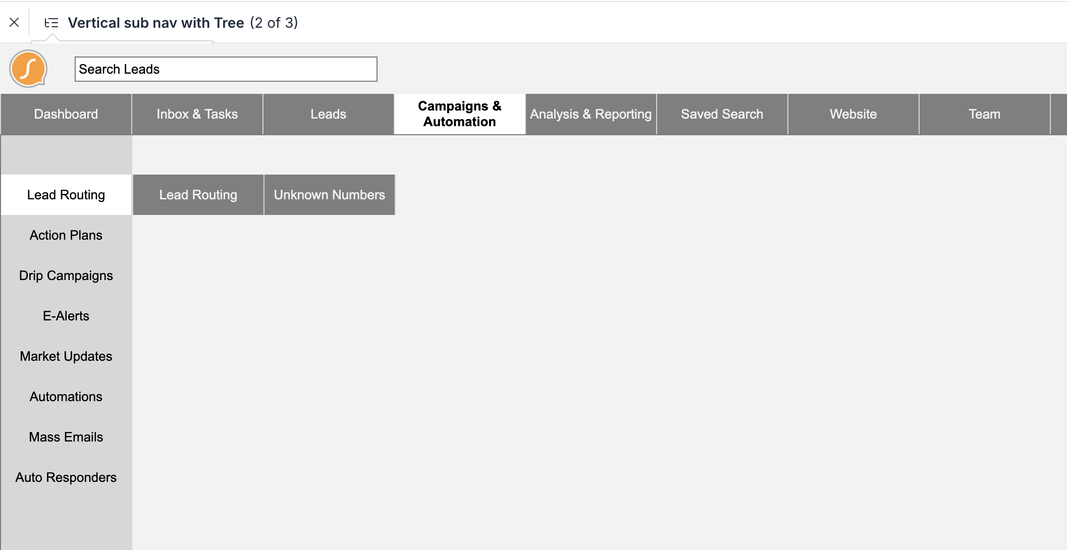
| Campaigns & Automation | Lead Routing | Lead Routing, Unknown Numbers | Side Tab | |
| Action Plans | Fully Automated, Traditional | Side Tab | Leads Menu | |
| Drip Campaigns | Side Tab | |||
| E-Alerts | Side Tab | |||
| Market Updates | Side Tab | |||
| Automations | Side Tab | Moved from Cog | ||
| Mass Emails | Side Tab | Moved from Cog | ||
| Auto Responders | Side Tab | Moved from Cog | ||
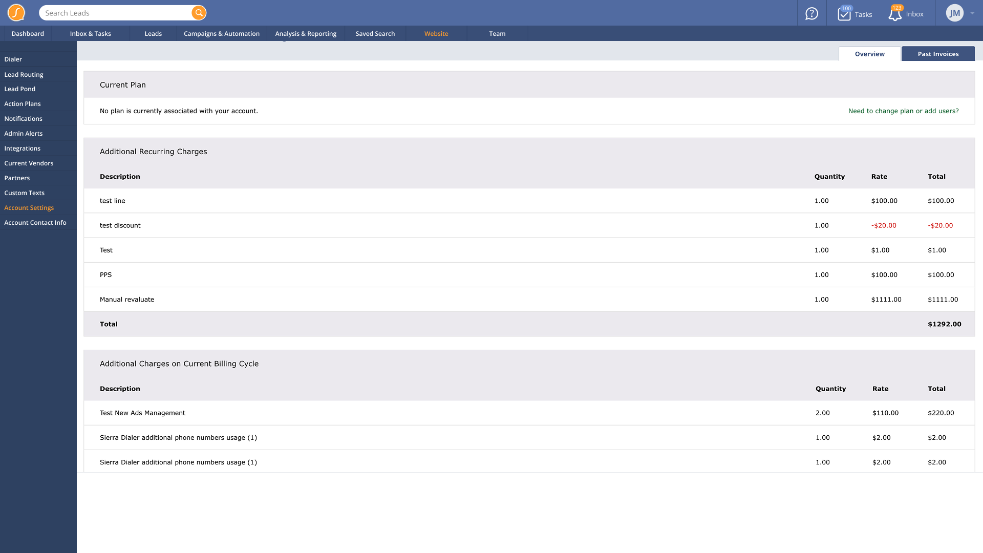
| Analysis & Reporting | Revaluate | Menu | Moved from Cog | |
| Reporting by Lead Source | Source Reporting, All Transactions, All Agents, My Transactions | Sub Tab | Moved from Cog | |
| Sold Data | Side Tab | Moved from Cog |
Prototyping
Using Axure, I created two prototype versions. The upfront work on the spreadsheet IA allowed me to rapidly build a workable prototype for testing.
Persona-driven navigation prototype (Agent)
Persona-driven navigation prototype (Manager)
Workflow/Tools navigation prototype
Workflow/Tools navigation prototype variant
Testing
Testing ran over 3 weeks with 7 users. We used Zoom and the Axure prototype, relying primarily on verbal feedback.
We developed a basic scoring rubric to track whether users could successfully navigate to key areas. This involved task-based questions like:
- “If you were tasked with managing a lead, where would you go?”
- “Where would you expect to create an e-alert?”
- “How would you find your pending tasks?”
The feedback was loud, as expected with real estate agents. The resounding favorite was the workflow/tools design.
Visual Design
I applied a clean style using the company’s existing branding.
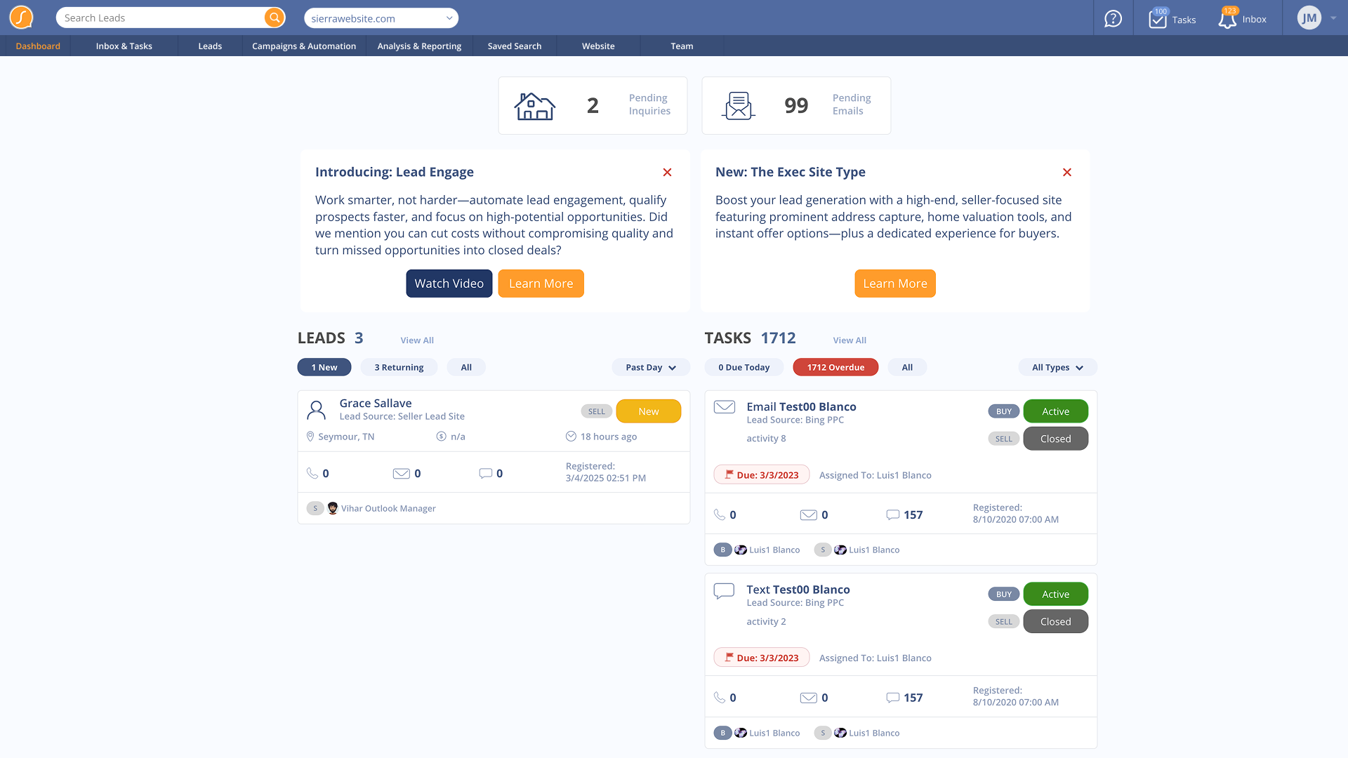
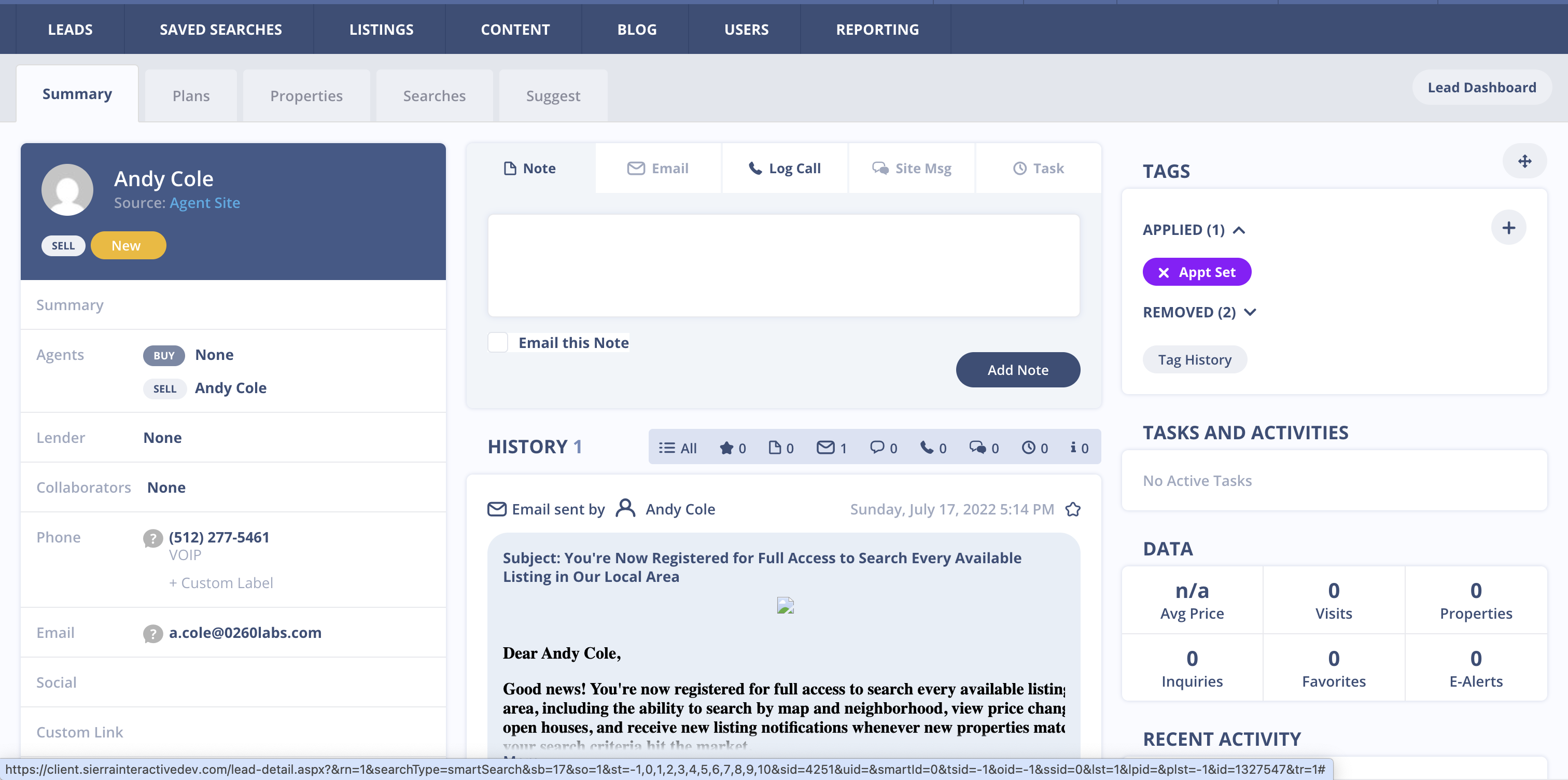
Dashboard
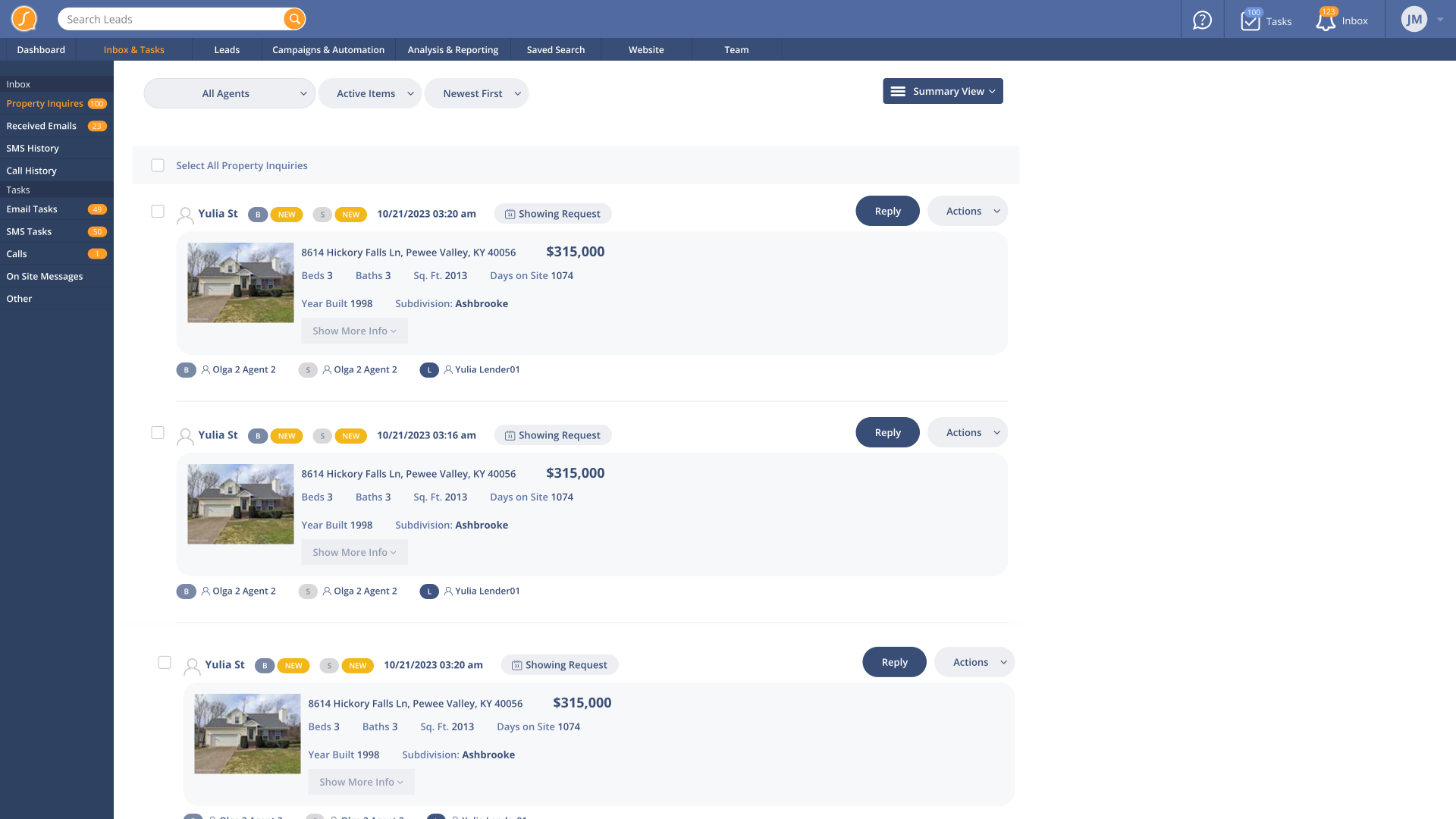
Inbox
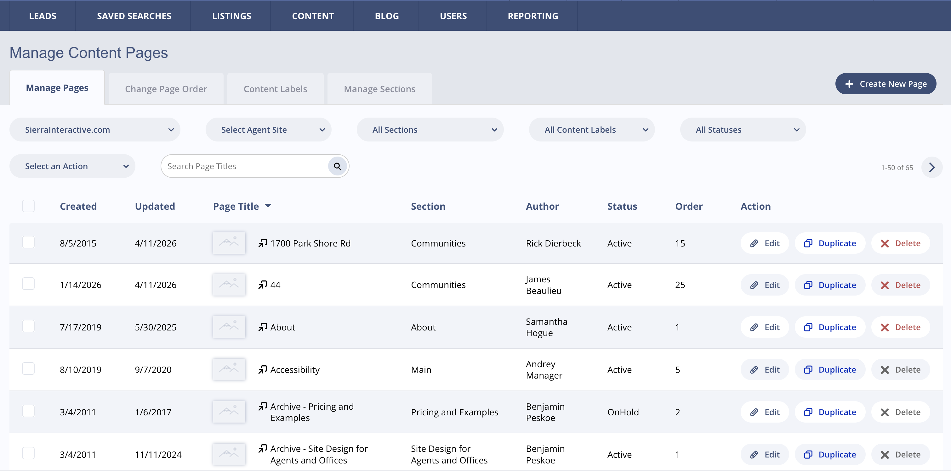
Leads
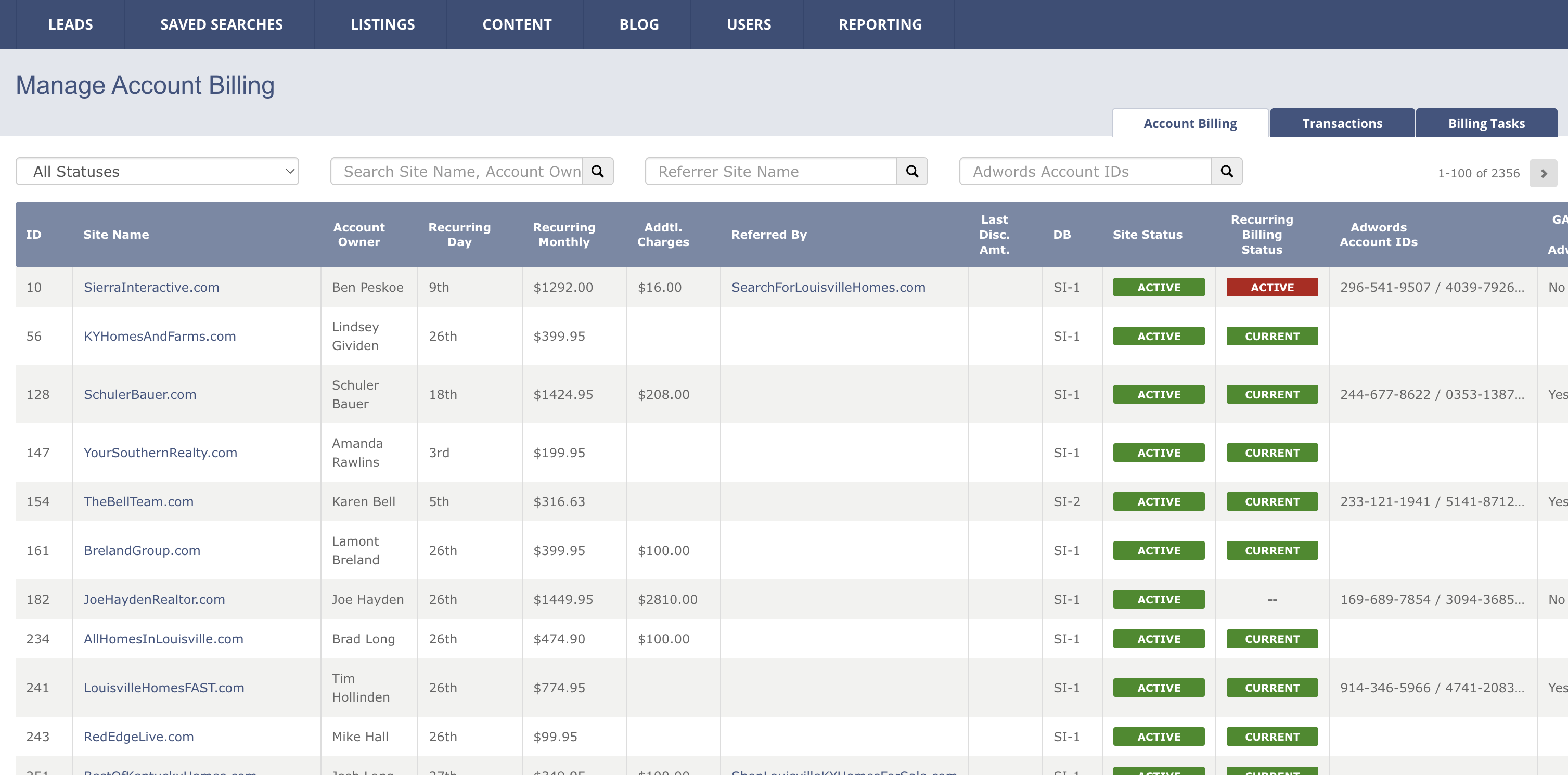
Settings
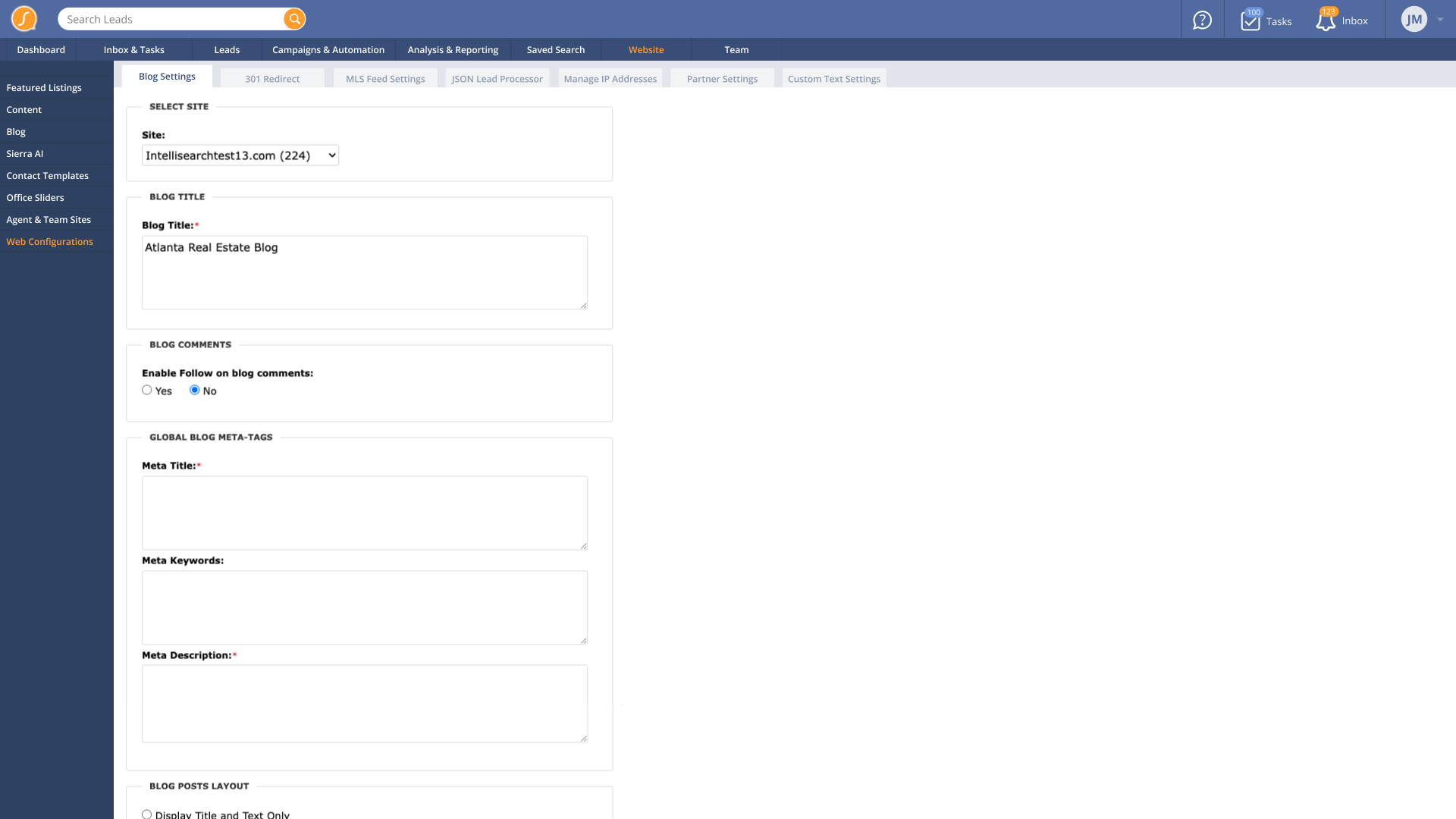
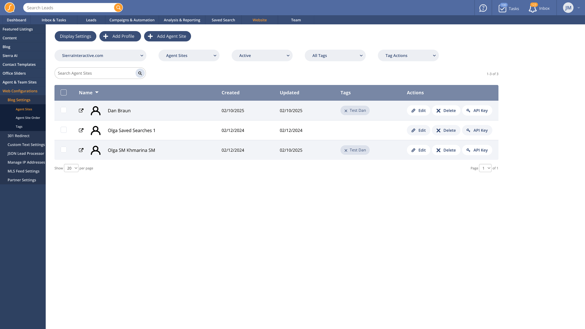
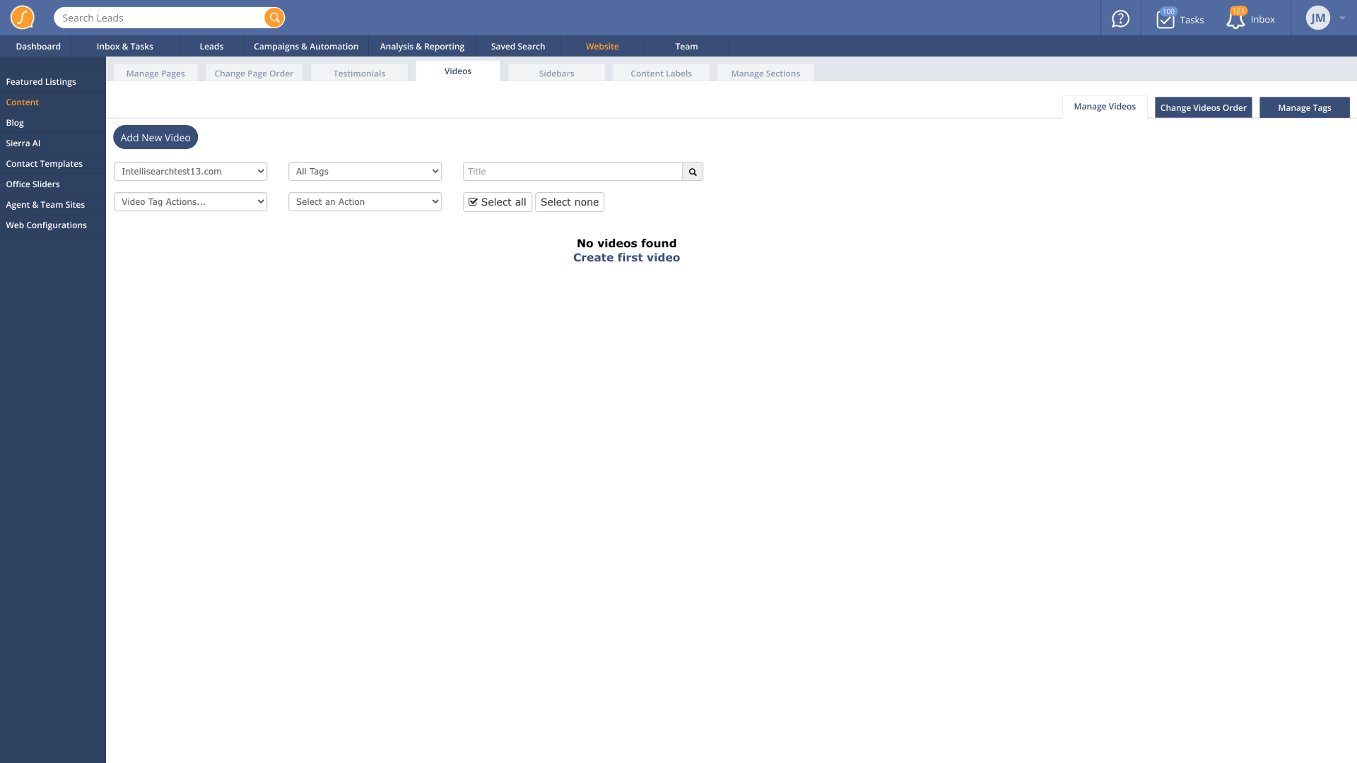
Web Configurations
Web Alternate: Nested side tab design we didn't go with because some pages had too many tabs to work well
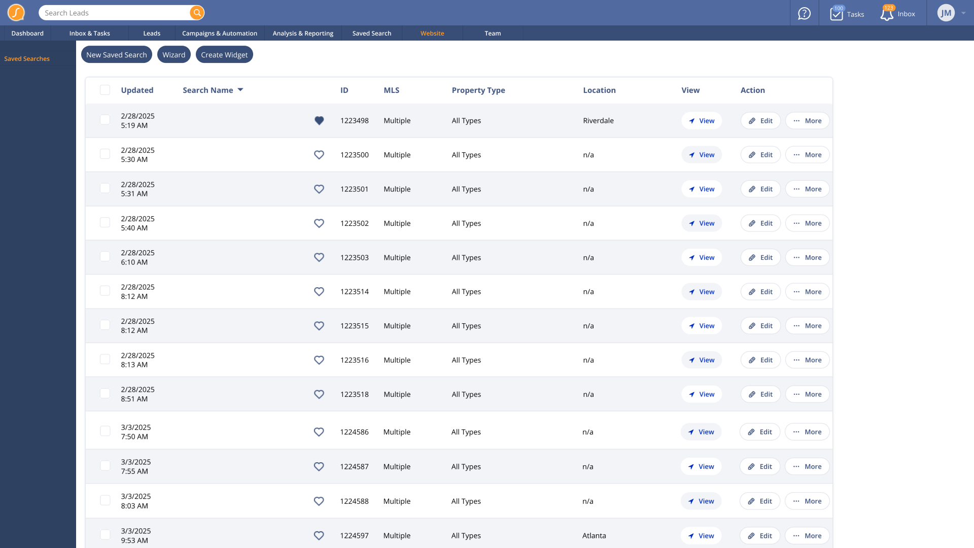
Saved Searches
Blog Video Content
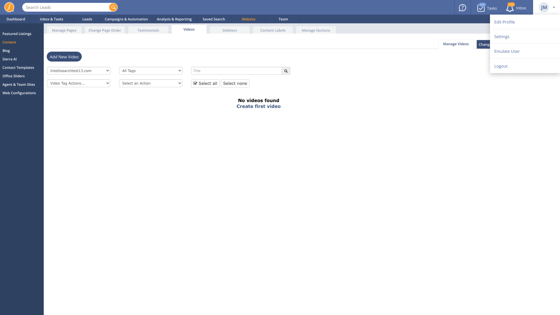
User Dropdown
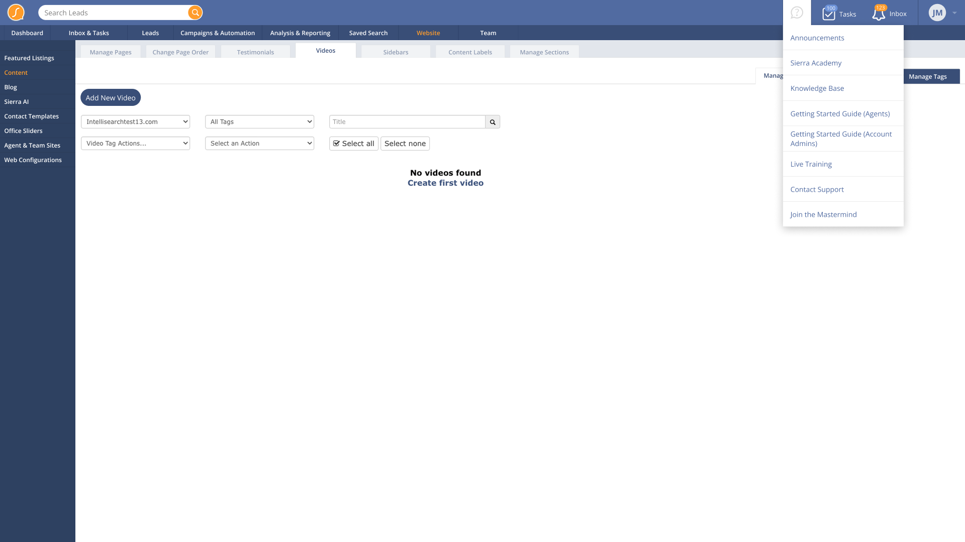
What's New Dropdown
Reflection
This is the type of work I thrive in. Modernizing legacy software comes naturally when you have a rigorous, meticulous process. It’s equal parts accountant, investigator, and designer.
This project took less than a month from discovery to final design. It tested well, was straightforward to implement, and improved user satisfaction.