Summary
Kitewheel Hub is a visual IDE used to design and manage complex, logic-driven workflows. Instead of writing code in a text editor, users assemble projects from interconnected nodes—abstracted coding concepts such as functions, decision trees, decision matrices, database connections, and JavaScript logic.
As projects scale, these visual workflows grow into dense, interconnected graphs with hundreds of nodes. While powerful, this abstraction makes it difficult to understand what has changed between versions of a project—especially since much of the logic inside a node is hidden behind modal interfaces.
I was tasked with designing a way to diff complex visual projects so developers, internal teams, and sales engineers could clearly see what was added, removed, or changed.
Context
Projects in Kitewheel are composed of reusable code blocks connected visually:
- Graphs act like functions, encapsulating logic and execution flow
- Decision Trees represent if/then logic that routes actions down different paths
- 2D Tables function as decision matrices, returning values based on input criteria
- Database connections and JavaScript nodes provide data access and custom logic
While this visual approach lowers the barrier to entry and enables powerful composition, it introduces a core challenge:
The logic that matters most is not visible at a glance.
To understand what a node does, users must open it and inspect its internal configuration.
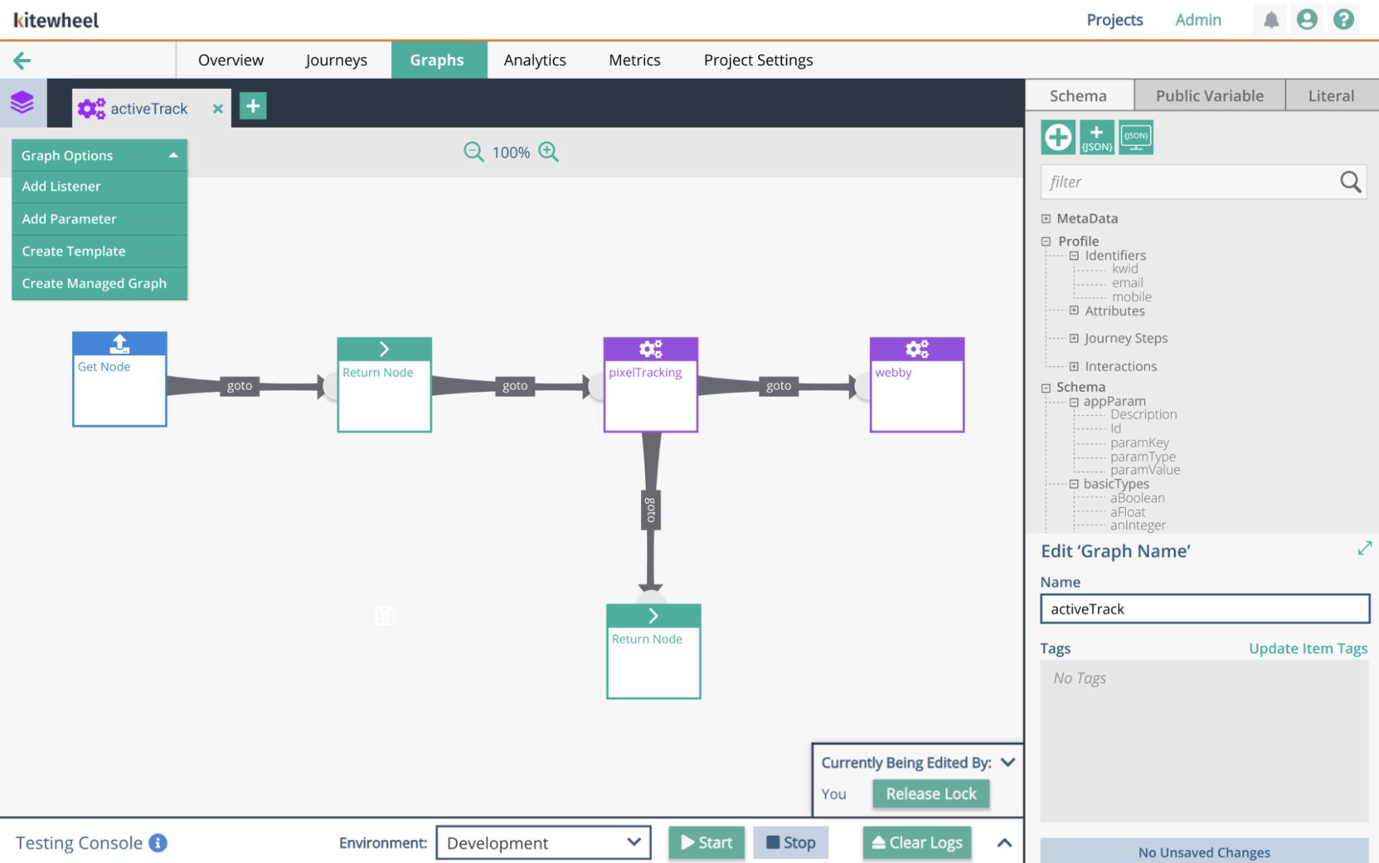
This is a simple function within Kitewheel
The Problem
As projects evolved, teams needed a way to compare versions and answer critical questions:
- What changed between version A and version B?
- Was logic added, removed, or modified?
- Did this change affect behavior, routing, or data?
In practice, answering these questions was nearly impossible:
- Large projects resembled dense spiderwebs of interconnected nodes
- Visual comparison did not scale
- Internal logic was hidden inside nodes and modal views
- There was no equivalent of a traditional code diff
Developers and internal teams relied on handwritten notes, tribal knowledge, or side-by-side browser tabs—introducing risk and slowing collaboration.
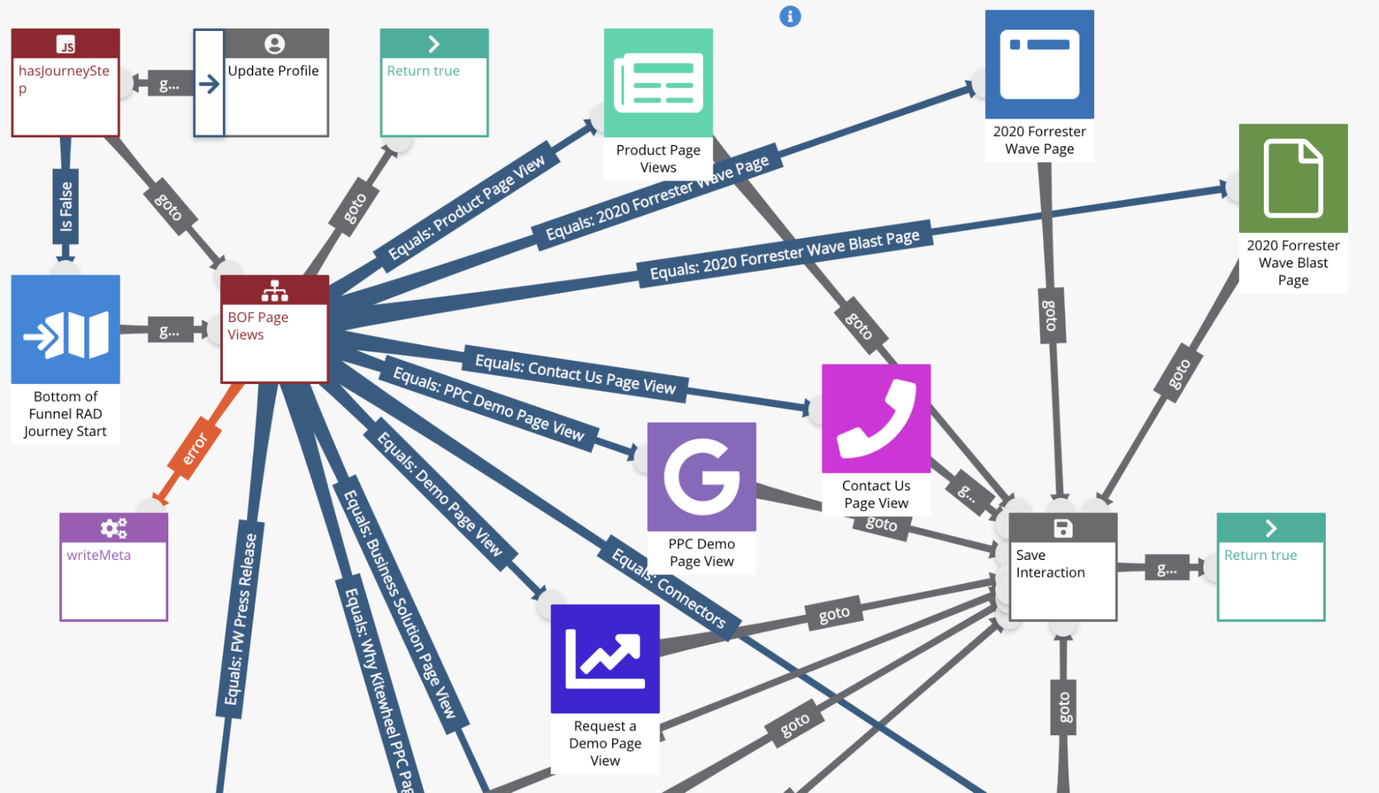
Complex spiderwebs. Inner workings of complex node logic within matrix tables and decision trees were impossible to see from the spider web and inner workings were also difficult to understand where changes were made
Design Process
I began by creating a design brief that clearly defined the problem, goals, MVP scope, and timeline. Given the complexity and risk involved, alignment up front was critical.
Research & Discovery
I first studied how modern text-based editors handle diffs, since developers already have strong mental models for comparing code changes. While effective for text, these approaches do not translate directly to a visual, node-based system.
To ground the work in real behavior, I spoke with developers and frequent users of Kitewheel. Most described a manual and error-prone process—writing things down and visually comparing project graphs by opening two versions in separate browser tabs. This confirmed both the scale of the problem and the lack of a viable existing solution.
Exploring Existing Patterns
I searched for precedents in visual programming tools and IDEs but could not find an existing solution to this problem.
I then looked beyond IDEs for inspiration. Version history tools like Google Docs demonstrated how change could be surfaced without overwhelming users, but I wanted to preserve the two-column diff model developers are accustomed to in code editors.
The breakthrough came from an unexpected place: software retrospectives.
Retrospectives often use a simple two-column layout—what worked vs. what changed—to compare states clearly. I applied this same mental model to the diff experience:
- Left column: Before (original state)
- Right column: After / Delta (changed state)
This allowed users to compare versions side by side while maintaining spatial consistency and clarity.
Screenshot of an early prototype sketch
Unifying the Diff Model
A key insight was realizing that this comparison strategy could be applied consistently across all node types, regardless of their underlying complexity.
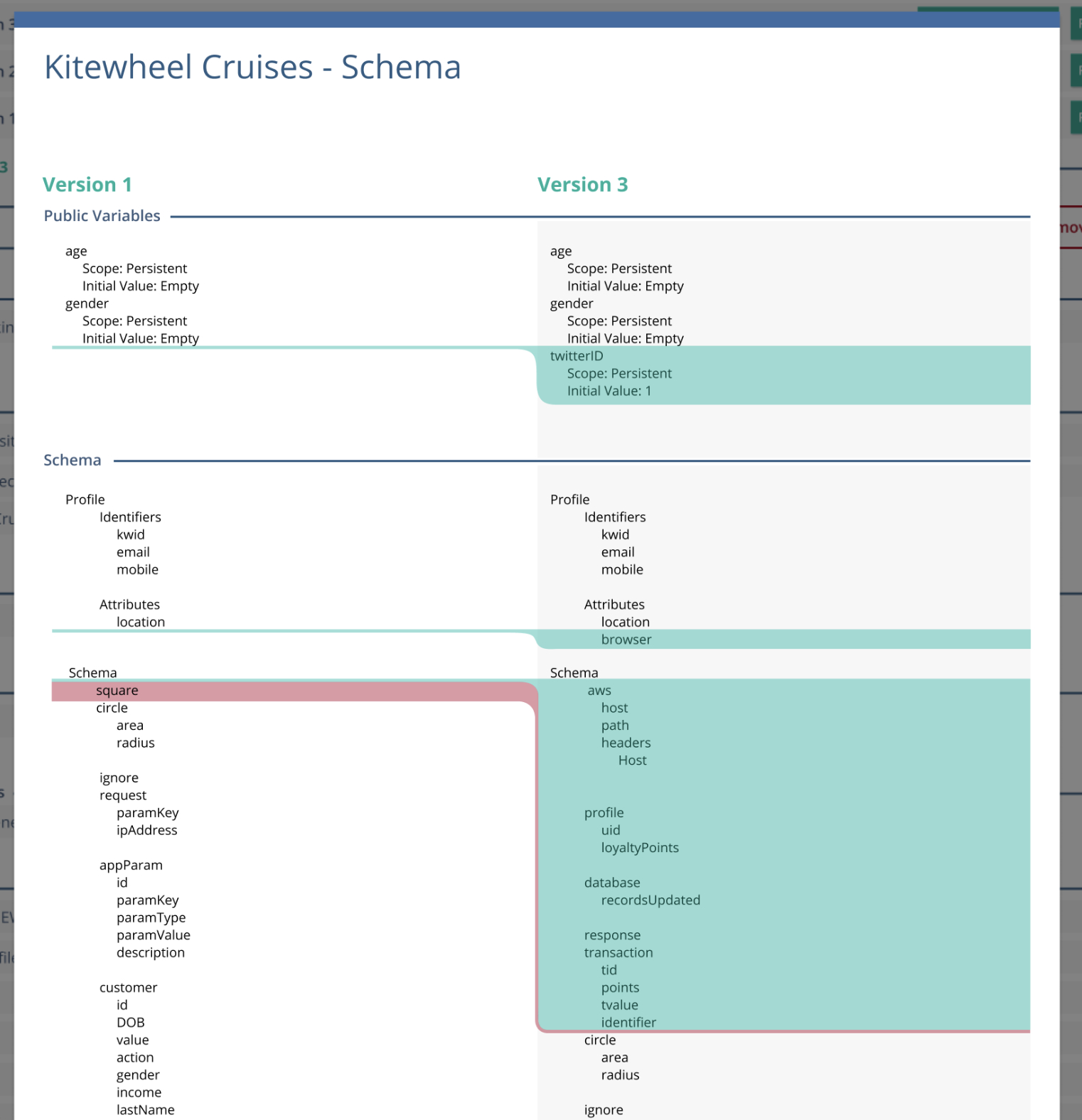
Every node—graphs, decision trees, tables, database connections, or JavaScript functions—could be represented as a simple key:value structure.
By normalizing nodes in this way, the diff experience became:
- Predictable — the same model applied everywhere
- Scalable — complex nodes did not require new UI patterns
- Understandable — changes were expressed clearly as before/after values
In practice, this resulted in a two-column view with original values on the left and changed values on the right, surfacing only meaningful differences.
The Diff Experience
Users access the diff by navigating to Project Settings, selecting the Diff tab, and choosing two project versions to compare.
The resulting view groups project components by type:
- Journey Maps
- Journey Steps
- Graphs
- Nodes (adaptors and logic)
- Project Schema (key:value metadata)
Each component is explicitly listed and visually annotated:
- Added components are highlighted in green
- Deleted components are highlighted in red
- Modified components are highlighted in blue
- Unchanged components receive no designation, reducing visual noise
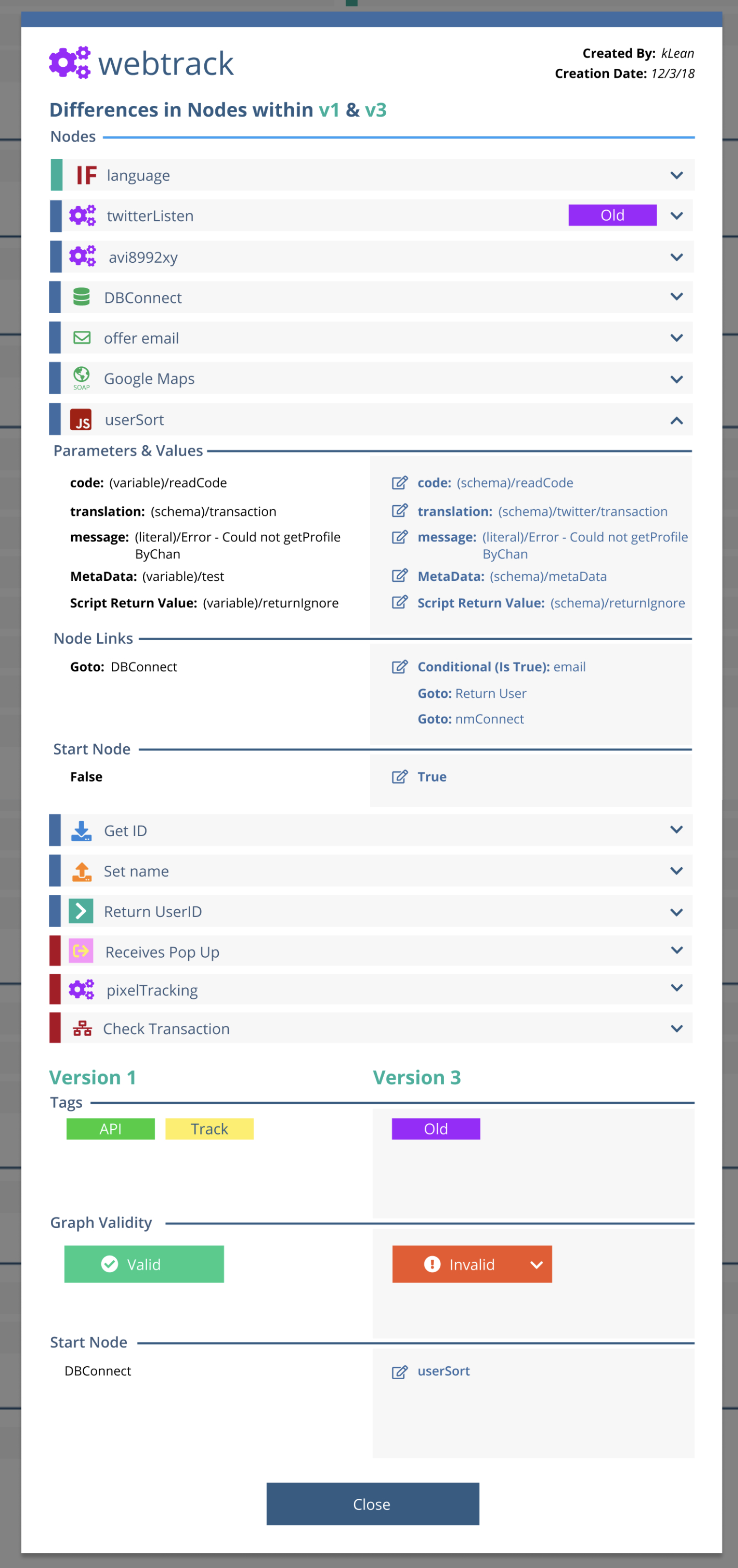
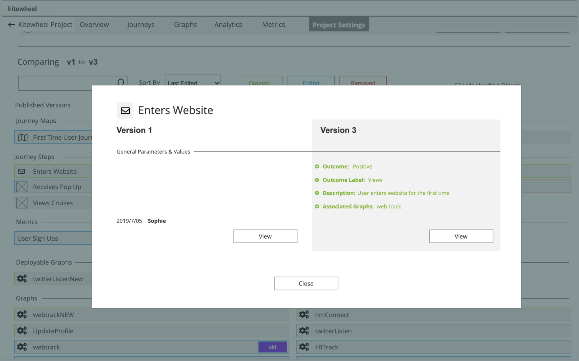
Selecting a modified component opens a modal showing a side-by-side key:value comparison, surfacing only the values that changed.
This layered approach allows users to move from a high-level overview down to precise logic changes without navigating dense visual graphs.
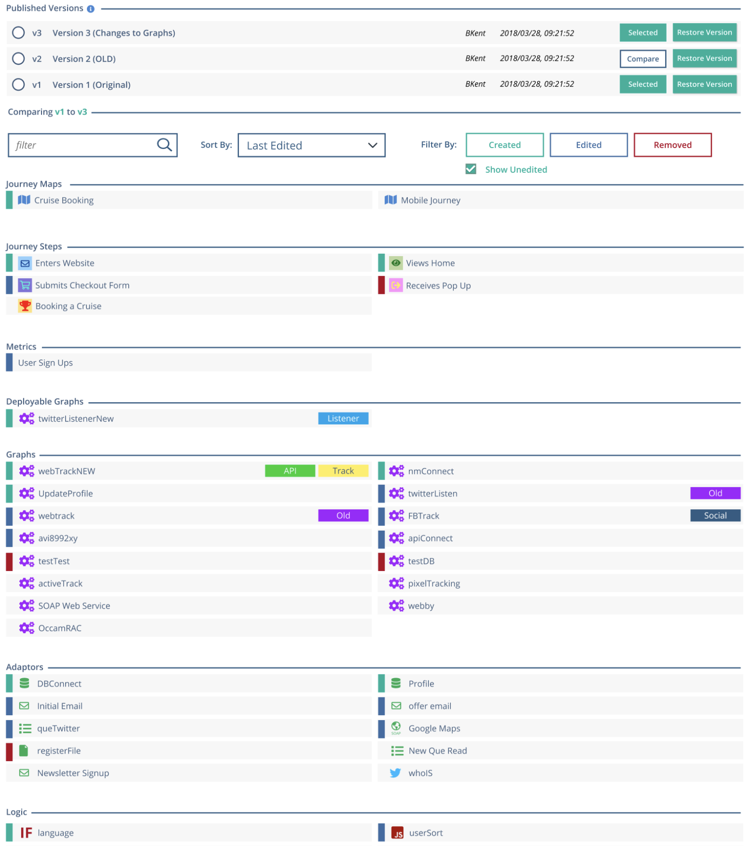
A diff being performed on two project versions. Each node type is placed under its respective section. Nodes that were changed, deleted or modified are bubbled to the top and highlighted in their respective color
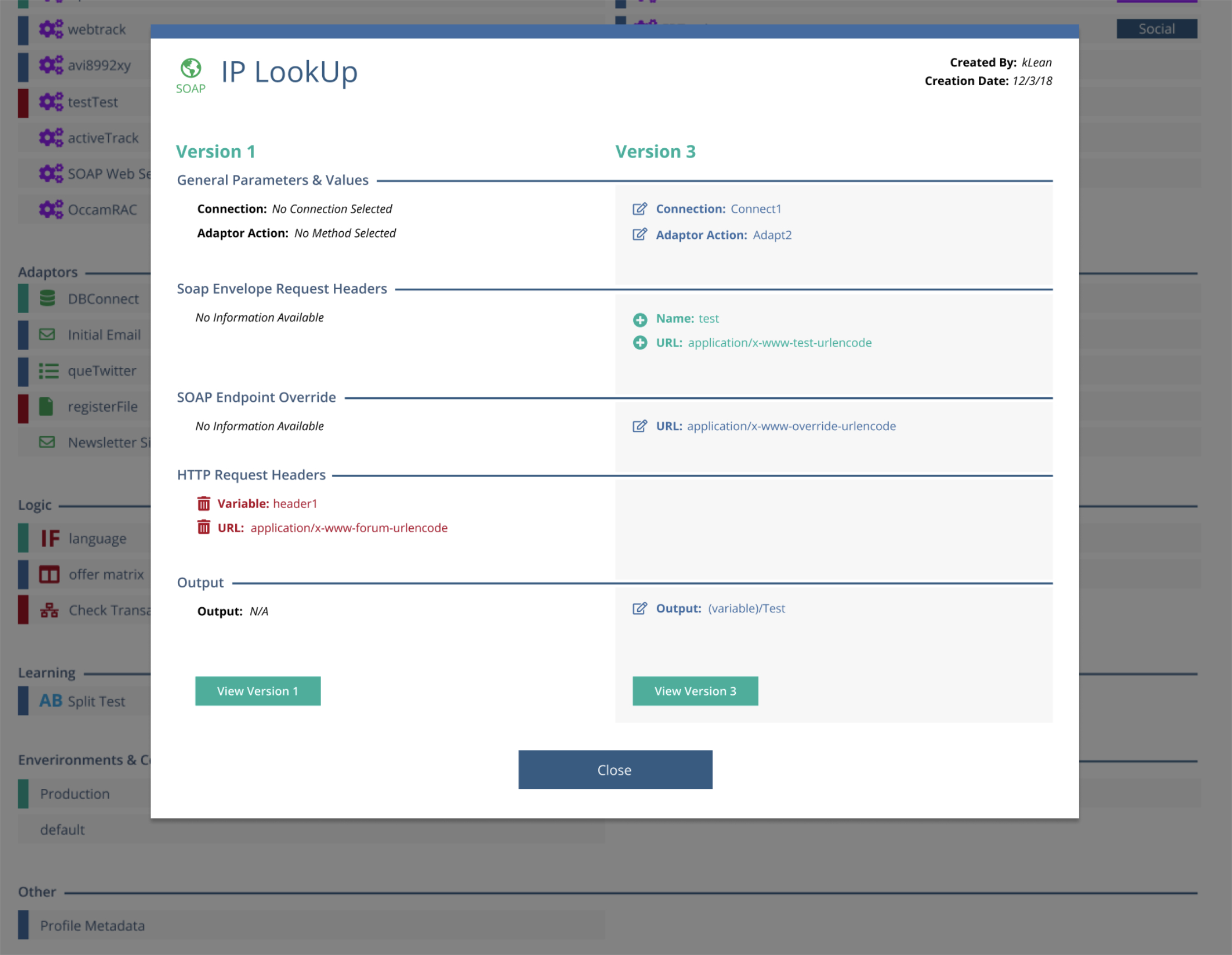
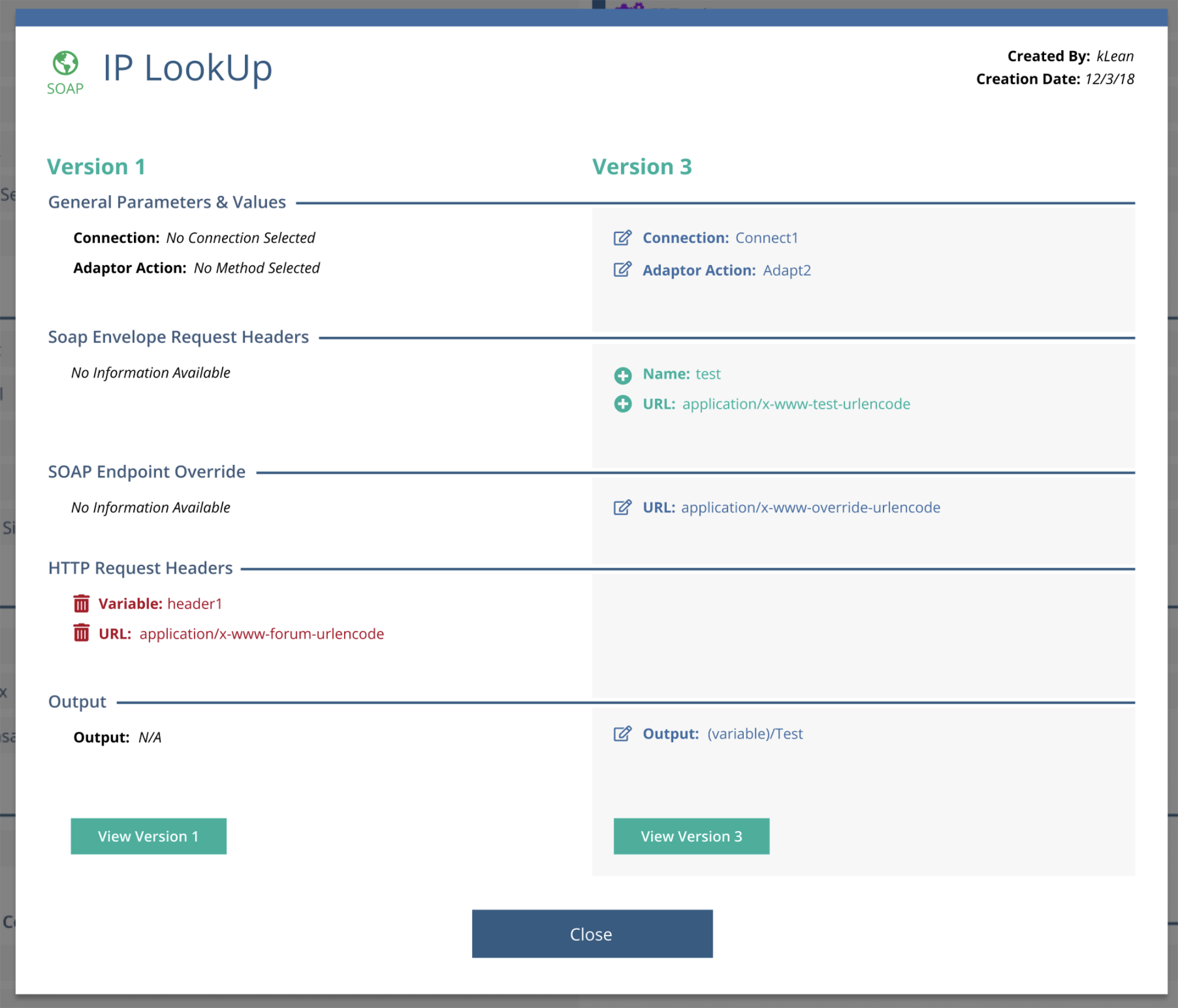
Modal windows displaying changes within a graph node in a column style key:value orientation
Handling Complex Exceptions
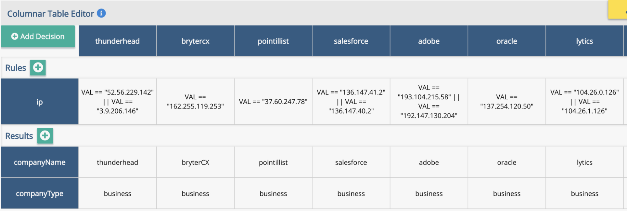
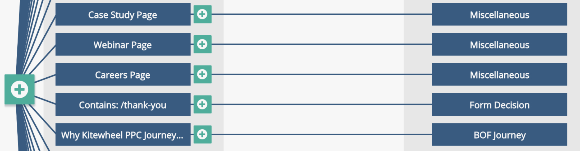
Most node types mapped cleanly to the column-based diff model. However, decision trees and decision matrices required a different approach.
These nodes encode logic spatially rather than linearly. Forcing them into a strict columnar format would have obscured the very structure users rely on to understand behavior.
For these cases, I introduced a stacked comparison model:
- The original version is displayed above
- The updated version is displayed below
Within decision matrices, individual cells that were added, deleted, or modified are highlighted directly in context using the same color system (green, red, blue), with the text inside each cell reflecting the change.
This preserved spatial meaning while maintaining consistency with the overall diff language.
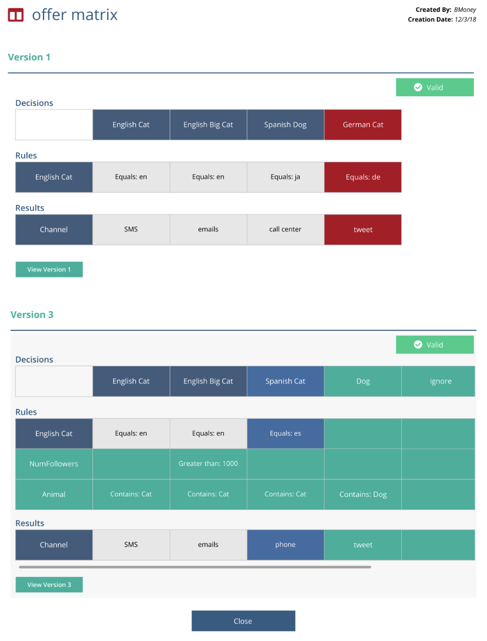
How a matrix changed between versions. Green cells were added, blue were modified and red were deleted (shown on the original)
Validation & Testing
To validate the design, we tested the experience with 8 participants using an interactive Axure prototype.
Feedback strongly validated the approach:
- Participants described the design as extremely intuitive
- Users quickly understood the before/after comparison model
- Participants felt confident identifying what changed without inspecting full project graphs
Key Insight
One usability issue surfaced around the detail dropdown. At first, some participants did not recognize it as interactive.
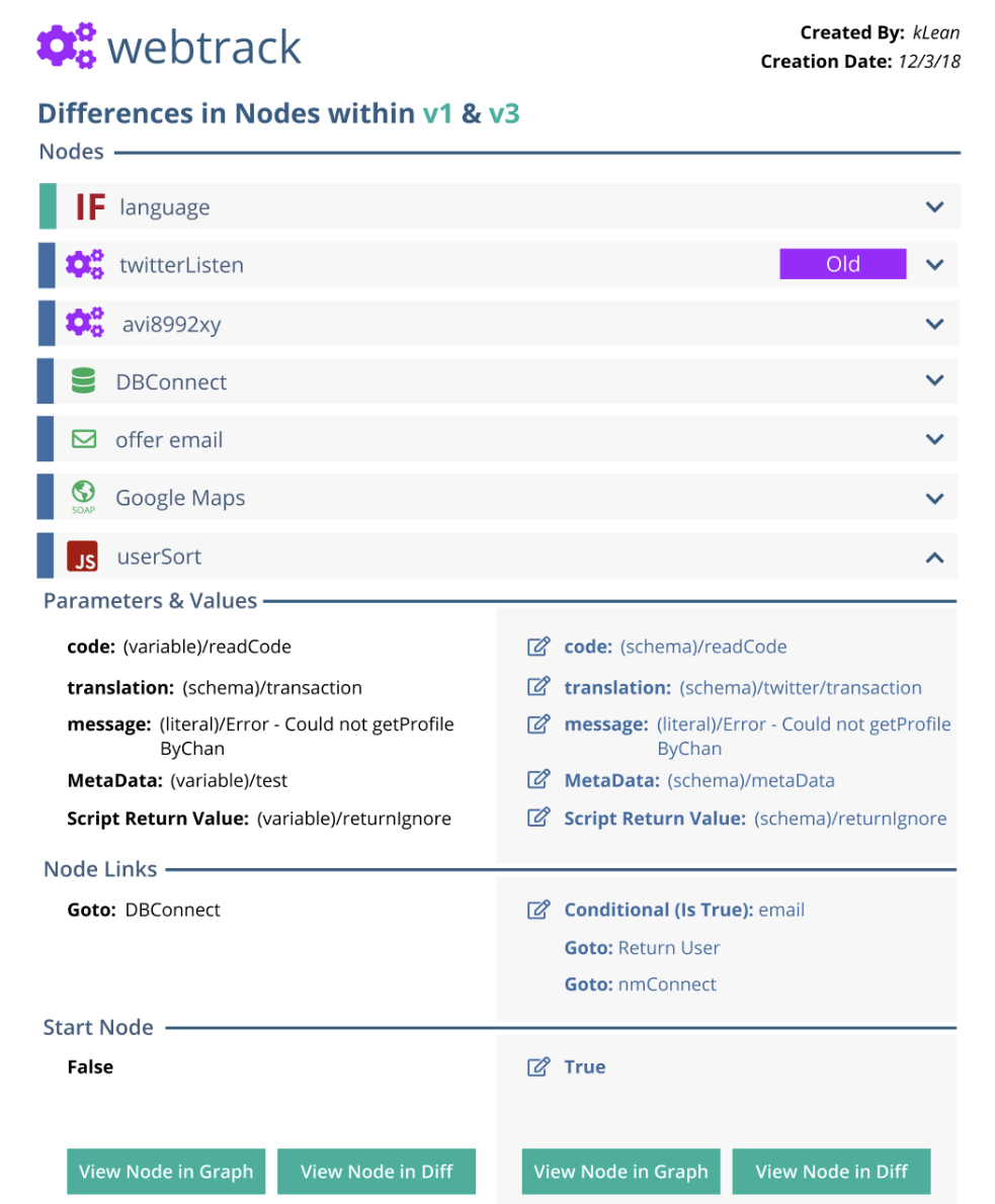
This was due to the nested nature of the data. Graphs can contain their own nodes, and when a graph-level diff was opened, users were presented with a list of changed child nodes. Each child node could then be expanded to reveal its own before/after key:value diff.
While consistent, this additional layer reduced discoverability. This insight informed refinements to visual hierarchy and affordances to better signal nested interactivity without increasing cognitive load.
Outcome
The diff feature transformed how teams understood and communicated change:
- Developers could confidently verify behavioral differences between versions
- Internal sales and support teams could clearly explain changes to customers
- Risk was reduced by making hidden logic visible and explicit
- Large visual projects became auditable and understandable over time
By translating abstract, hidden logic into a clear comparison model, the design brought the benefits of traditional code diffs into a visual IDE environment.
A diff of a graph within a project containing its own nodes
Reflection
This project reinforced a core principle of my work:
Good UX makes invisible complexity visible—without exposing unnecessary detail.
Designing a diff for a visual programming system required treating abstraction not as a limitation, but as a design constraint—and using it to create clarity at scale.
Project Gallery